i know what you’re thinking! another palette? does this girl ever buy anything else?!? i assure you i do, and this will be the last palette for a while. i don’t make any promises for singles and quads though. eyeshadows are my weakness, especially if they come in palettes. i just love the huge range of pretty colors available. after all, green is my favorite, and i’m not adventurous enough to wear it anywhere other than on my eyes.
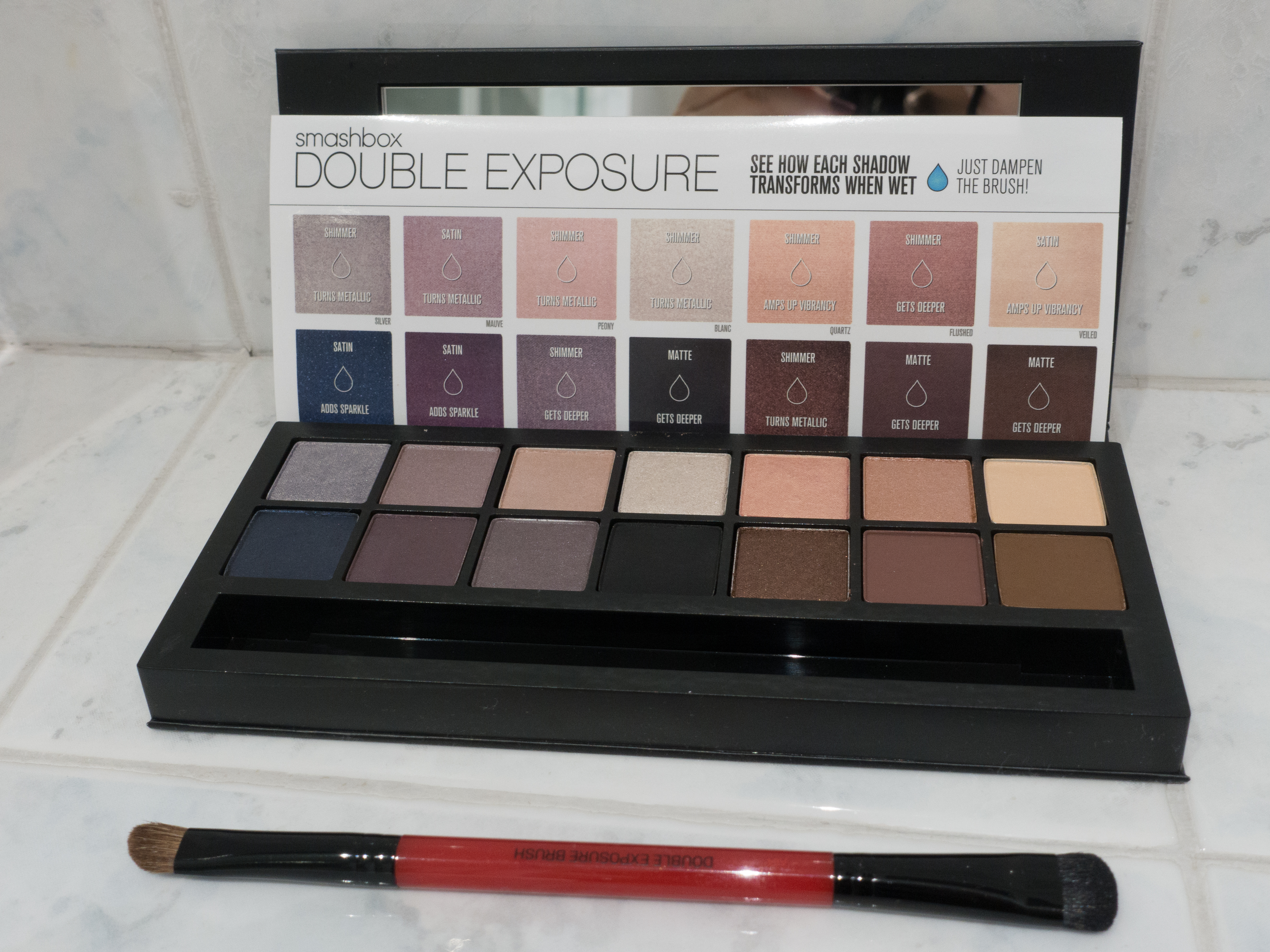
i’ve been coveting the Nars Dual Intensity Shadows for quite a while now but always passed them over in preference for the reformulated MUFE Artist Shadows. i figured i had to draw the line somewhere in order to not go bankrupt. i’m so glad i waited instead of splurging during the Friends & Family Sales madness. now instead of buying singles for $29 each (.05oz), i can try 8 colors for $79 (.03oz/color). i’m especially thrilled to see that a lot of the colors i was eyeing individually were selected for the palette – Subra, Giove, Andromeda, and Himalia. there is one exclusive shade, Ursa Major. the palette also includes a synthetic brush, but i don’t care much for it. it’s softer than most brushes included in palettes (ie. UD Naked 2 or Smashbox Double Exposure), but it’s not as easy to use as my Sigma or Hakuhodo brushes. i found that my own brushes gave a more pigmented look, when used dry, than the included brush. when damp, the included brush would sometimes splay a little and affect color placement. maybe it’s my technique though, as i have heard other bloggers liking the brush. be warned that the compact’s exterior is a mirrored surface, which attracts finger prints and smudges easily. since i store mine away in a drawer after use, i don’t really mind it looking smudged. the hinge is stiff enough that you can adjust the mirror to any angle you wish, and it will stay put.
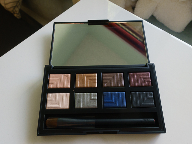
Nars Dual Intensity Eye Palette

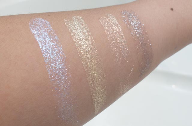
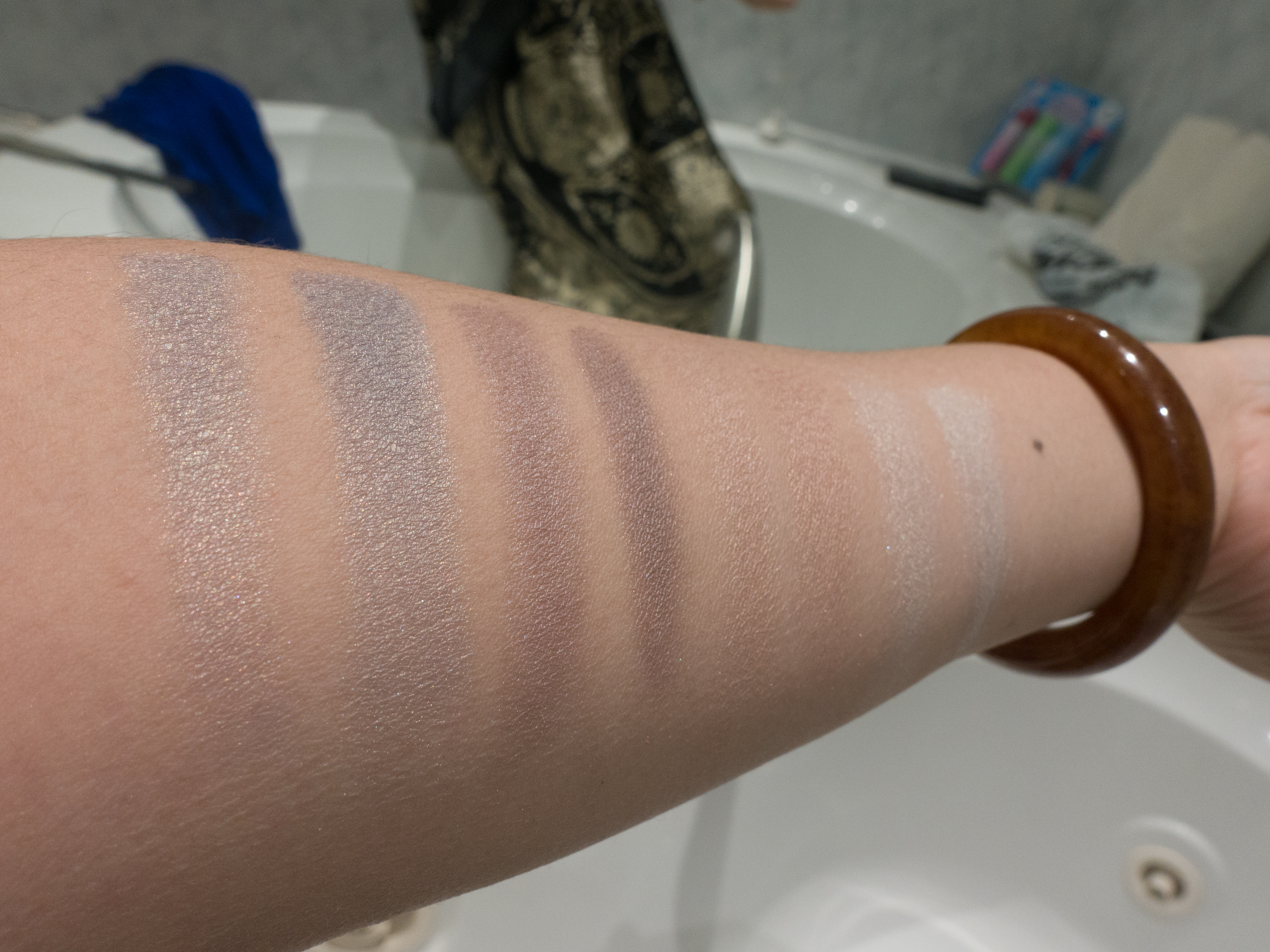
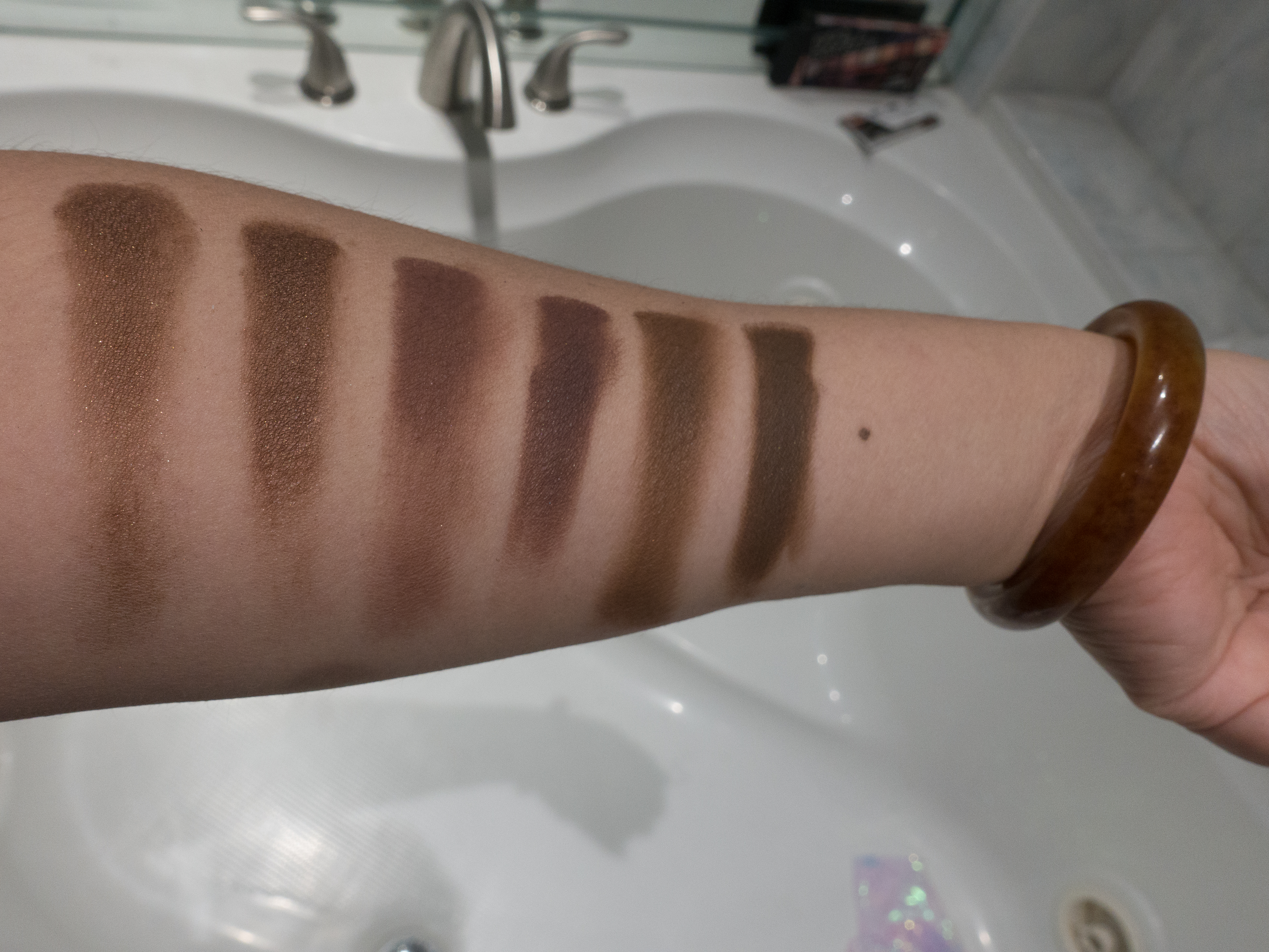
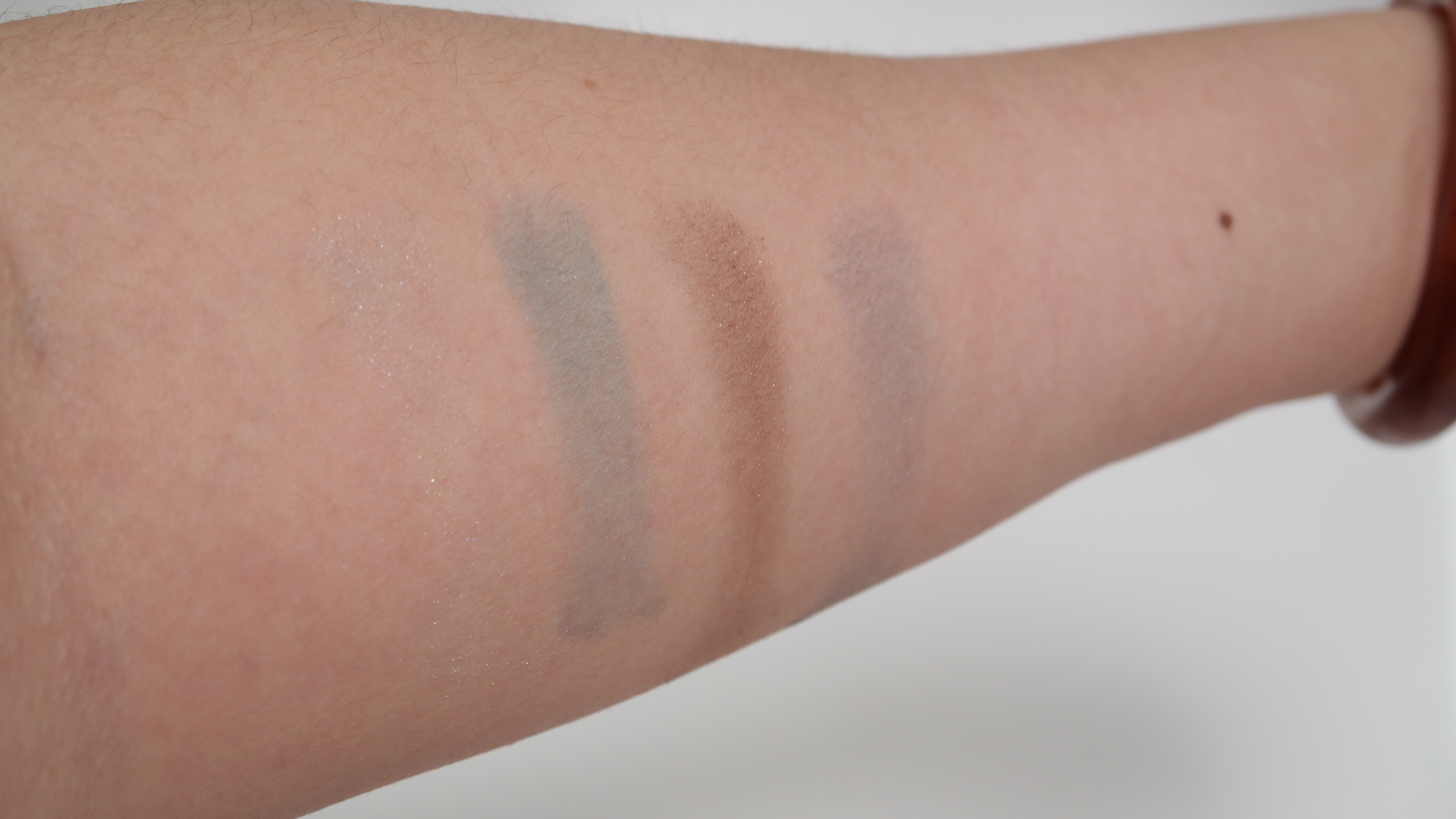
(L to R) Europa, Himalia, Ursa Major and Subra swatched dry then wet
as you can see, Europa is a bit sheer when used dry, but everything else is well pigmented.
- Europa is a pale peach with pink. when used dry it looks more peachy and is somewhat sheer. when used wet, the pink becomes more prominent and pigmentation more opaque.
- Himalia is a golden brown topaz shade. dry or wet it had nice pigmentation. when wet, the finish becomes much more metallic.
- Ursa Major is a medium chocolate brown. the color is lighter and warmer when applied dry and becomes more shimmery and cool toned when applied wet. this color is exclusive to the palette.
- Subra is a burgundy brown/purple. when used dry, it looks more brown. when used wet, the purple tones intensify.

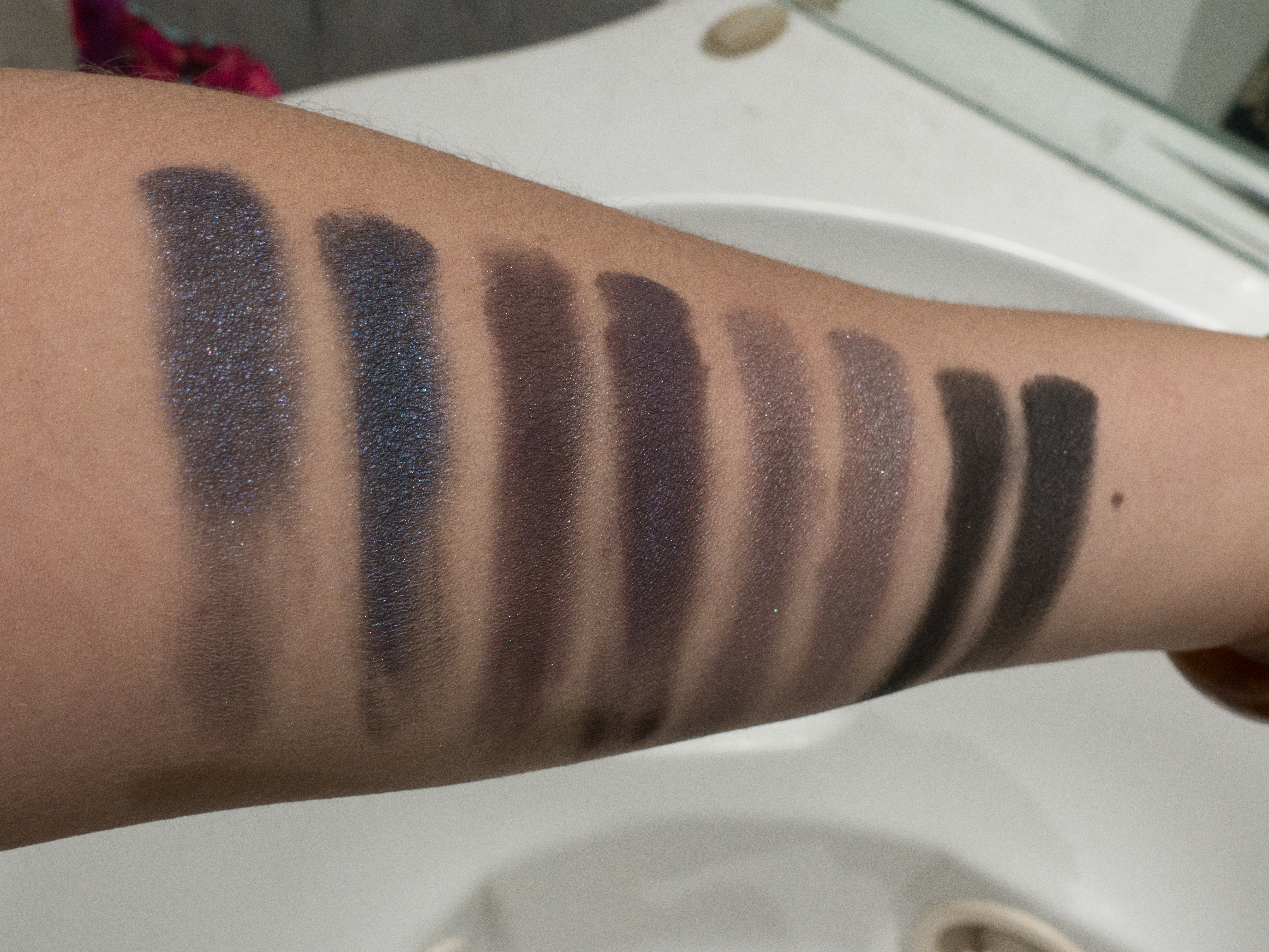
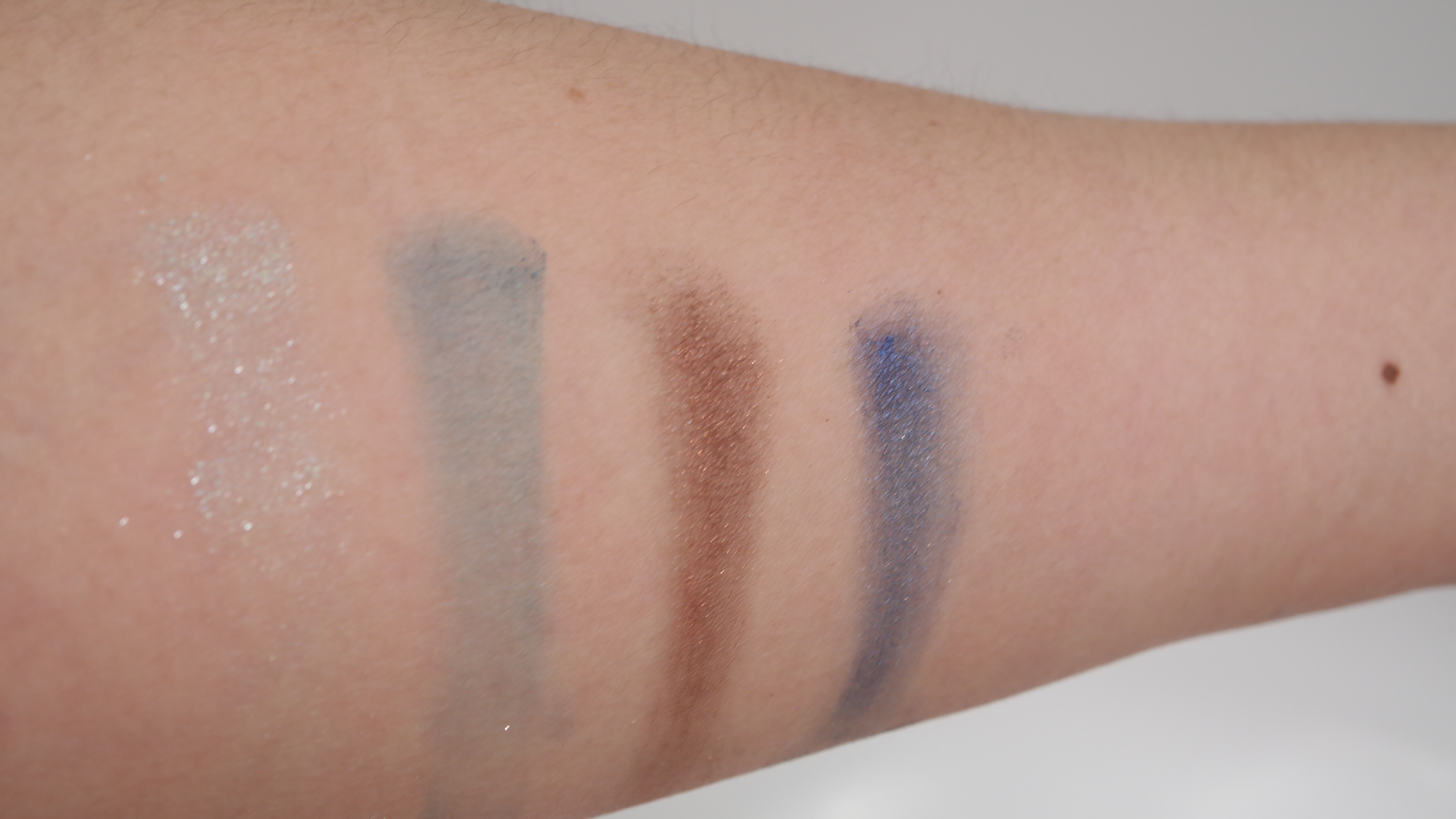
(L to R) Andromeda, Lysithea, Giove, Sycorax
- Andromeda is a pale beige that borders on white. like Europa, the pigmentation is sheer when used dry but becomes opaque when wet.
- Lysithea is a medium shark grey with a hint of warm olive. the olive is not really so much a color as it affects the tone of the silver. when dry, it’s a duller darker shade. used wet, it becomes much more metallic and lighter in color.
- Giove is a dark navy blue. when dry, it looks blackened and dull. when used wet, it becomes more metallic and blue.
- Syocrax is black. used dry, it’s a soft black that works well for giving the other shades a bit more dimension and drama. used wet, it comes a full, pigmented black.
now let’s see them in action!

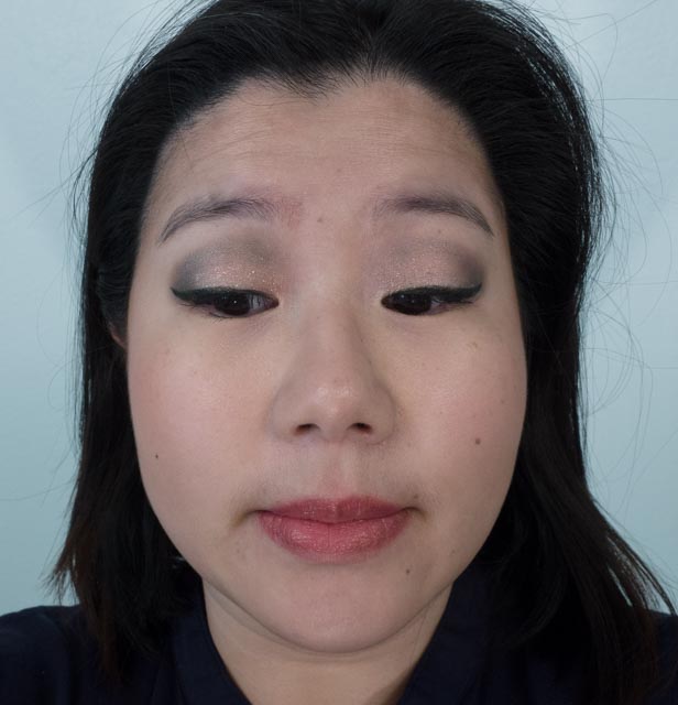
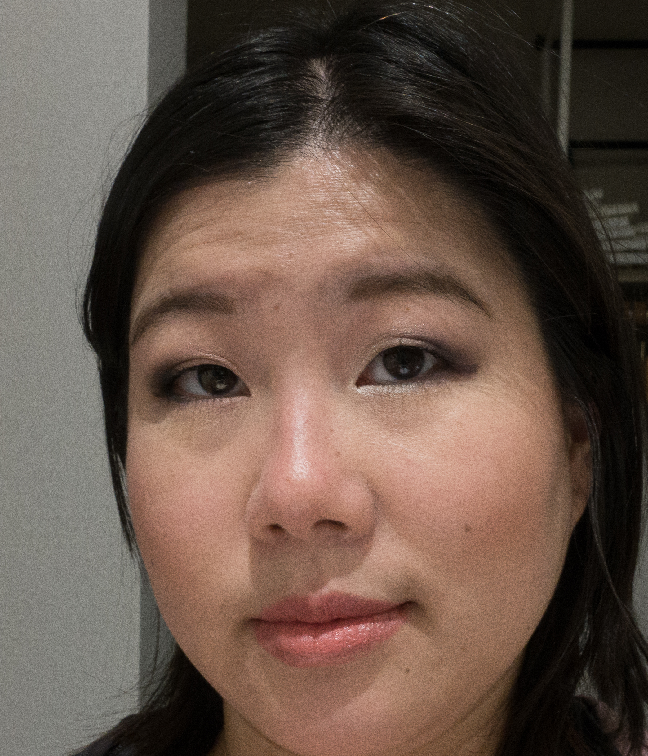
Europa, Subra and Andromeda
here you see Europa used wet with Subra used dry and Andromeda as a brow highlight and used wet in the inner corner.
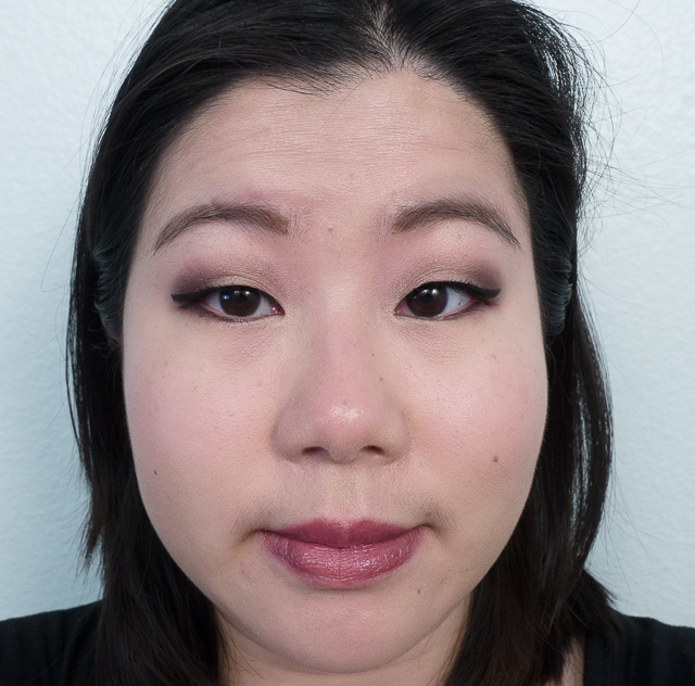
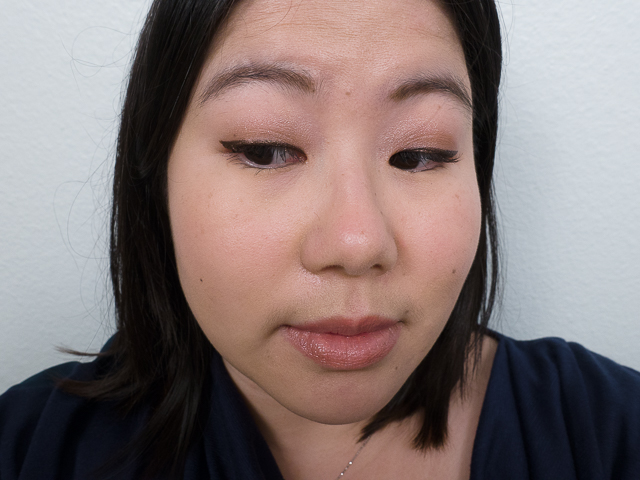
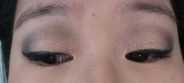
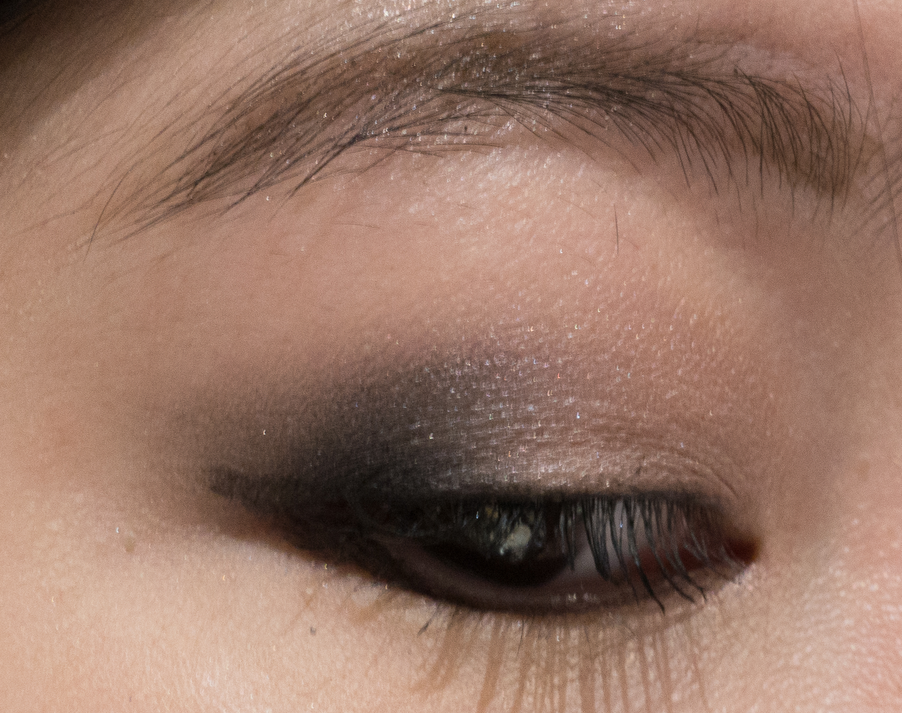
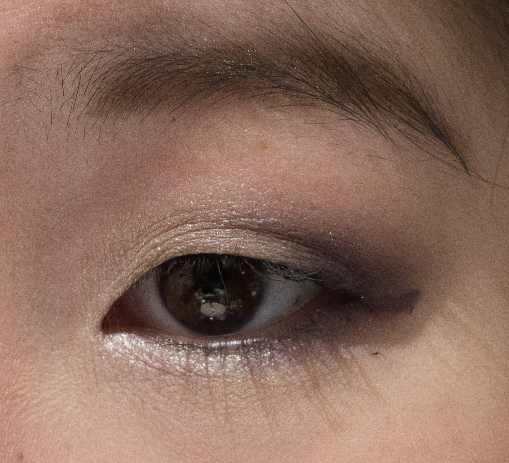
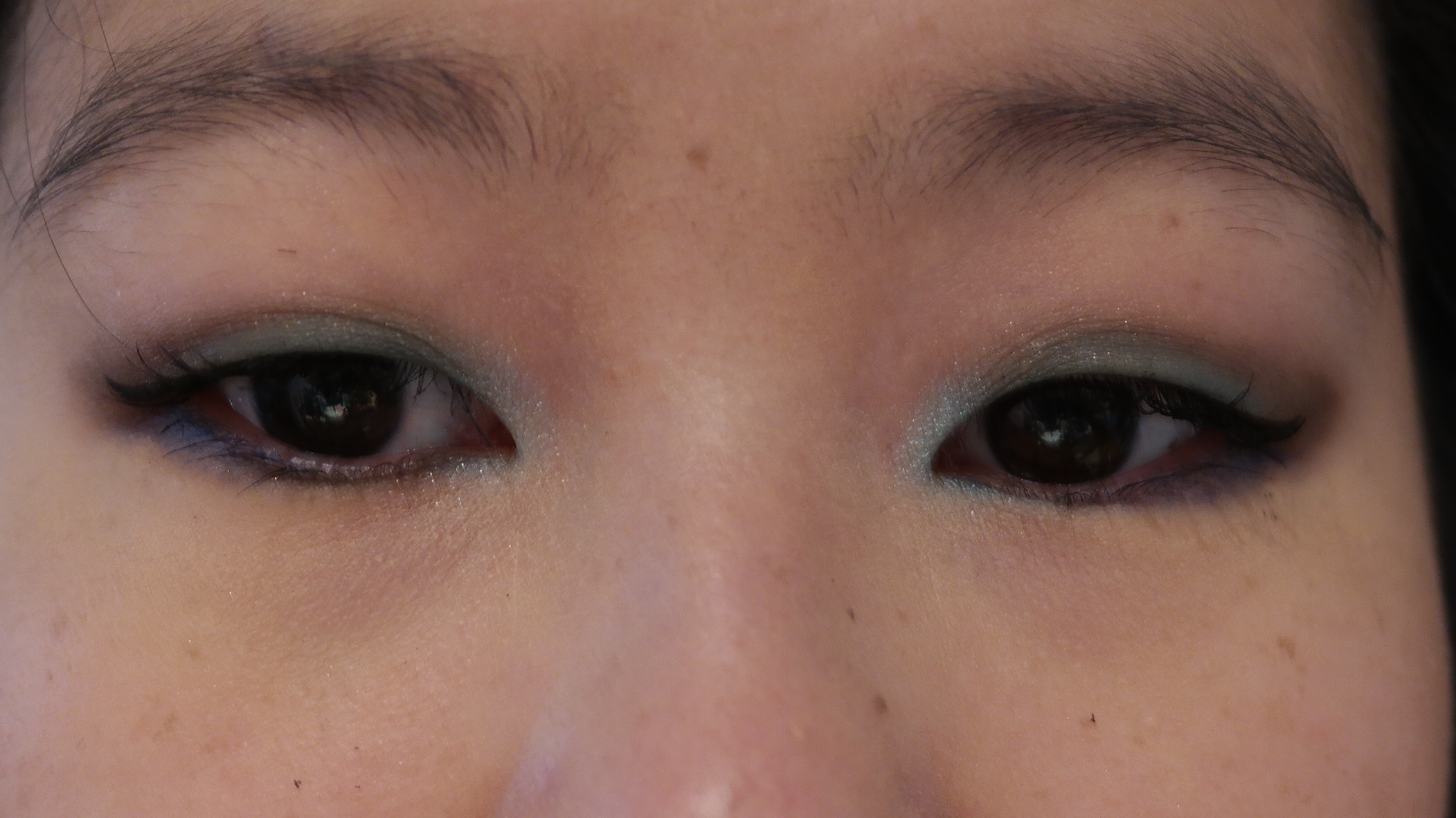
Europa, Sycorax
here you see Europa used dry on the lid with Sycorax used dry in the outer third and Sycorax used wet as a liner and Europa wet on the inner corner. notice how Europa shifts between peach and pink depending on whether or not it’s used wet. side note, if you tear easily, do not use Sycorax wet as a liner. it bleeds into a hot mess 😛 now i totally remember why my go-to is a waterproof liquid eyeliner!
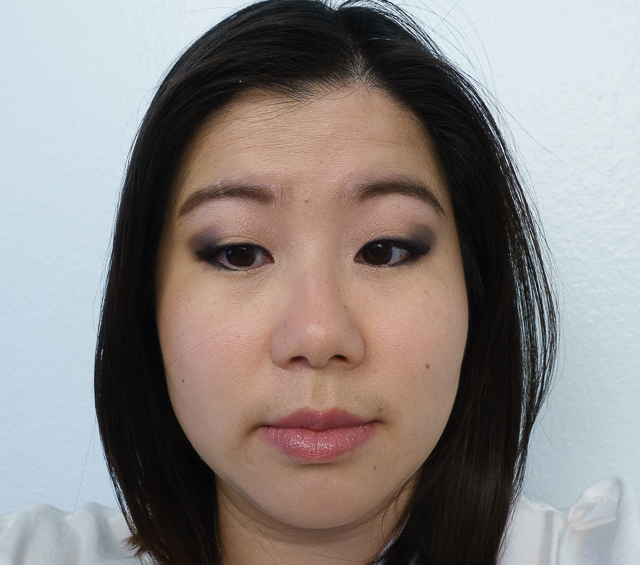

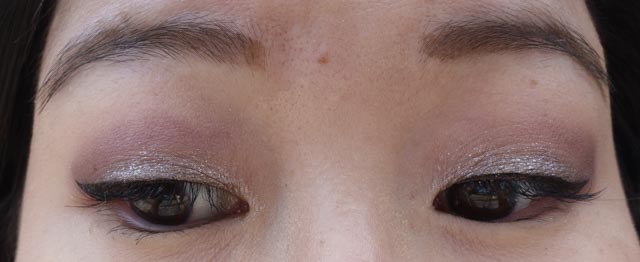
Europa, Subra and Andromeda
here i’ve applied Europa and Subra wet with Andromeda used dry as brow highlight. see how Subra intensifies and shifts more towards the purple spectrum? it does look a bit more purple in reality, but my camera is really uncooperative with brownish purple shades 😦
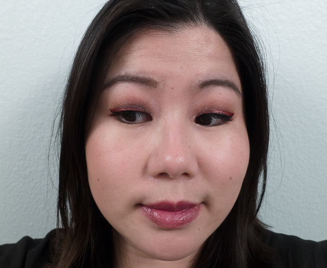
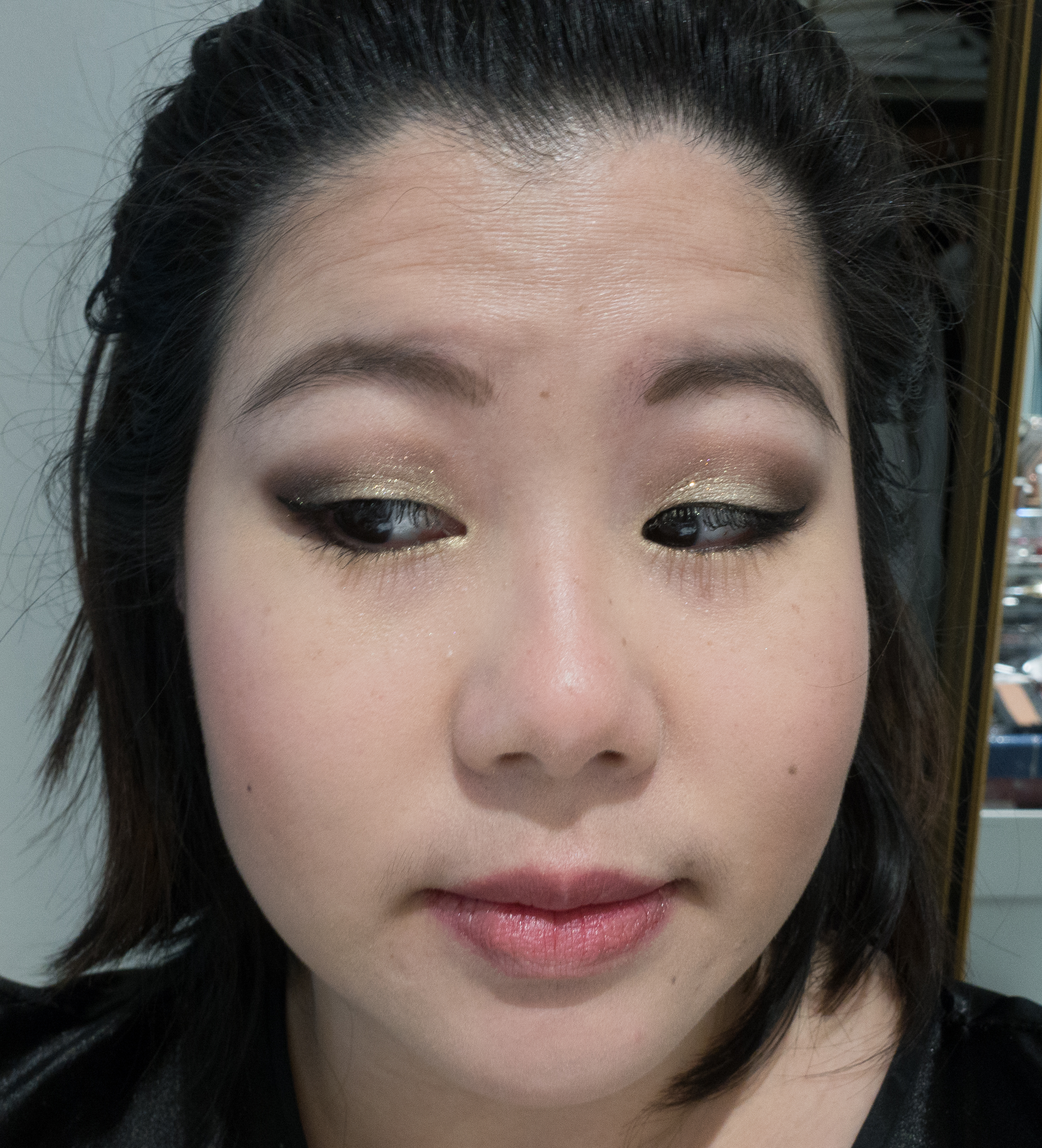
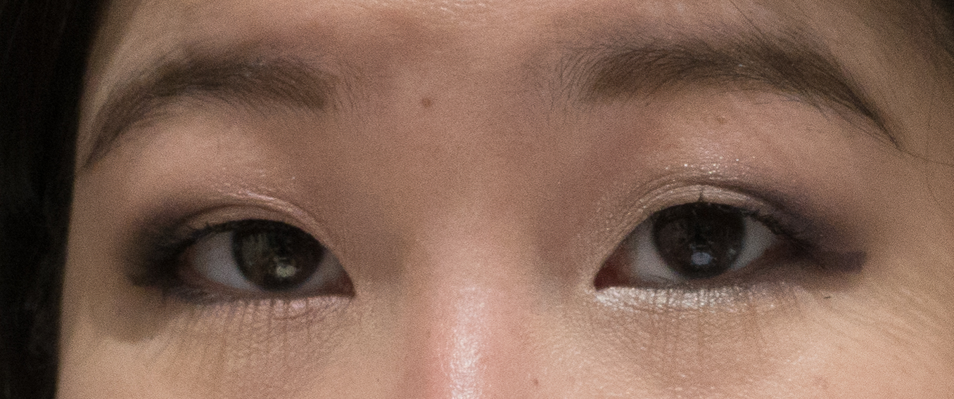
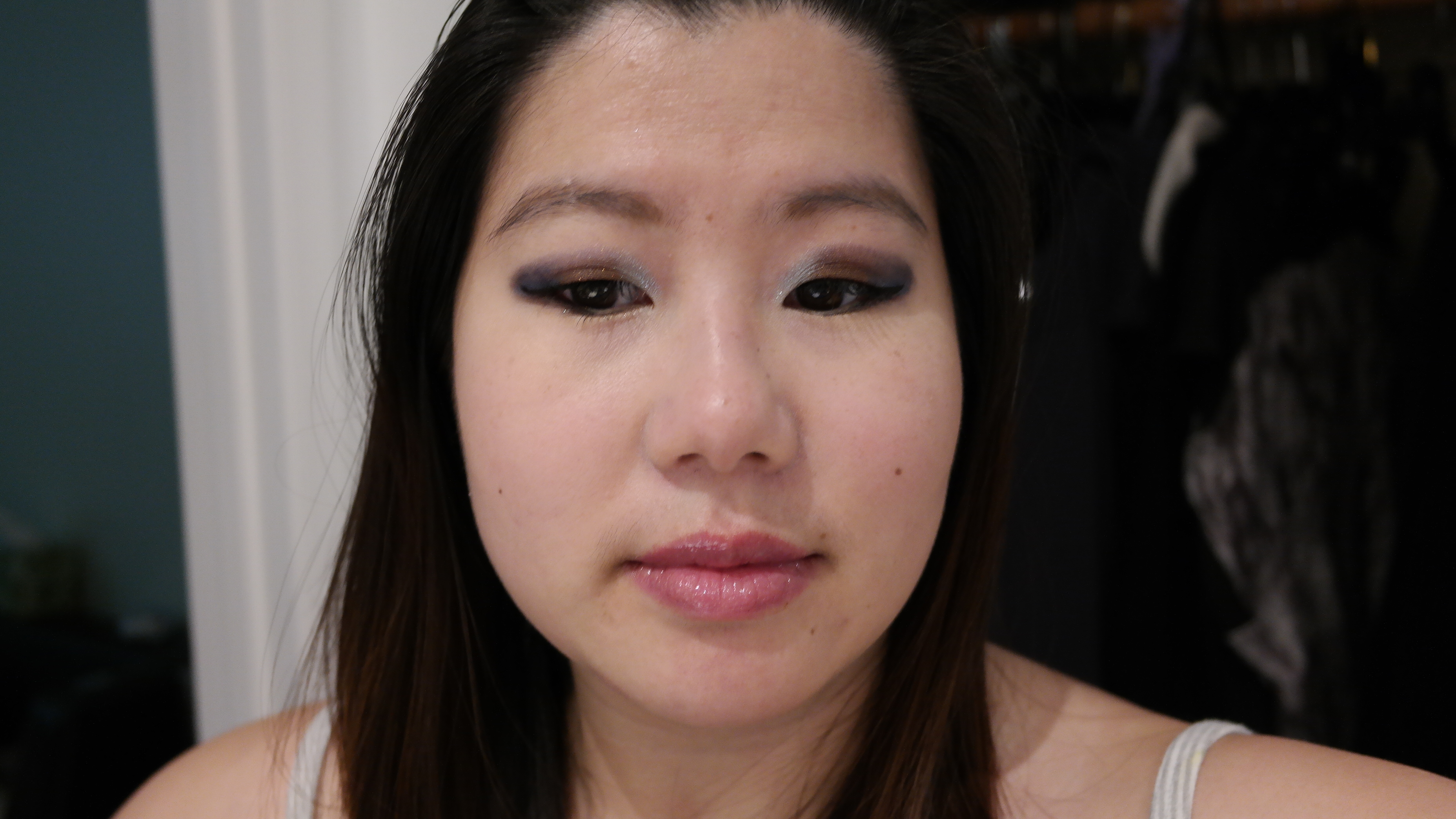
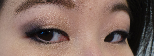
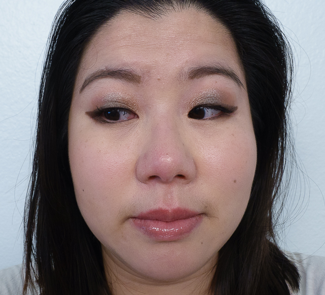
Himalia, Lysithea and Ursa Major
here you see Himalia used wet on lid with Lysithea used wet in the center of lid and Ursa Major used dry in the outer third. Ursa Major was also used wet as liner.
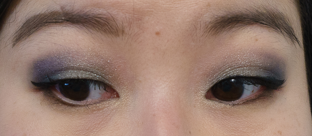
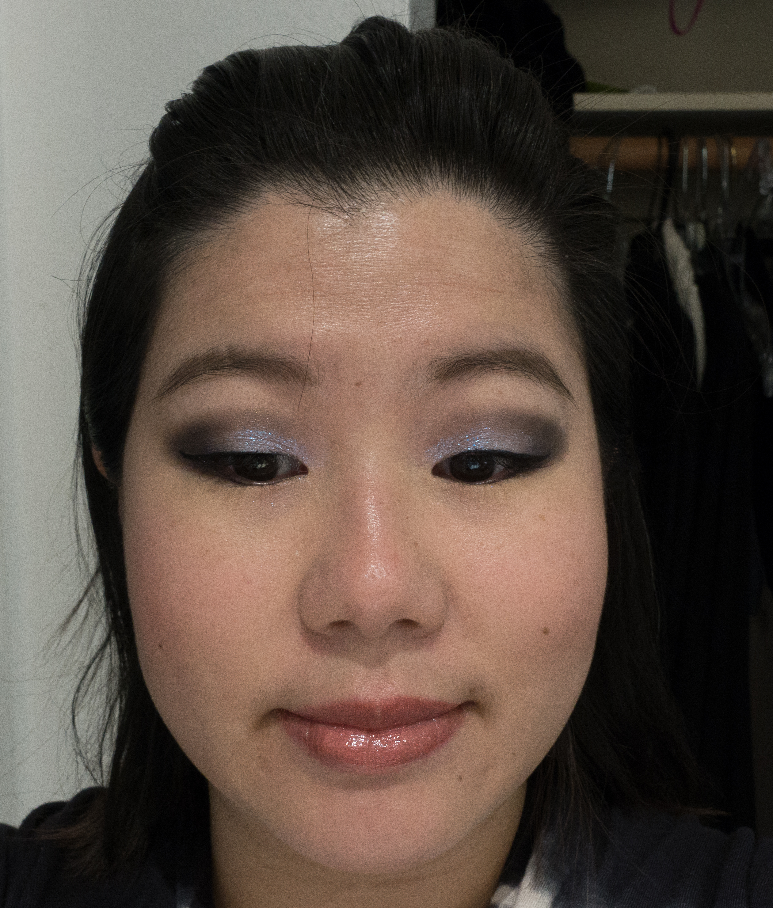
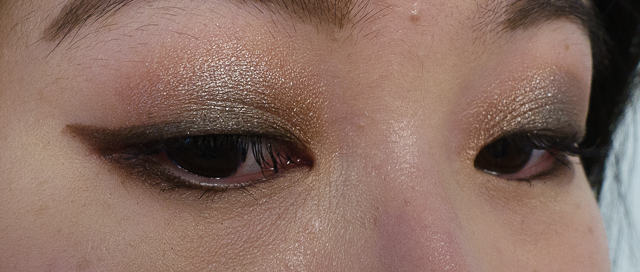
Lysithea, Giove, Andromeda and Ursa Major
i used all the shadows dry in this look. Lysithea and Giove with Andromeda on the inner corner and Ursa Major on the lower lashline. see how much darker Lysithea looks when used dry?

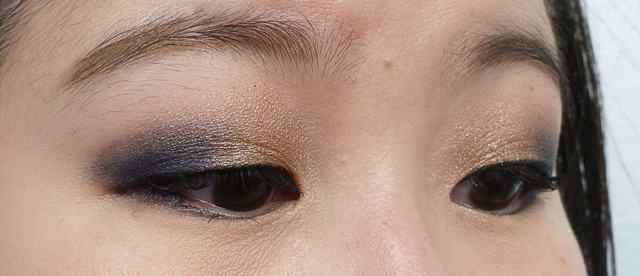
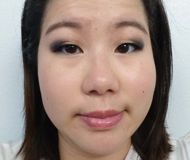
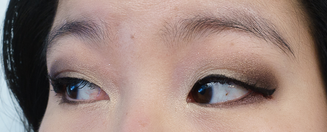
Himalia, Giove, Lysithea
here you see Himalia used dry, Giove used wet, and Lysithea used dry on the lower lashline. i love how wetting Giove really intensifies the blue!
Andromeda and Ursa Major
here you see both Andromeda and Ursa Major used wet.
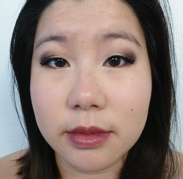
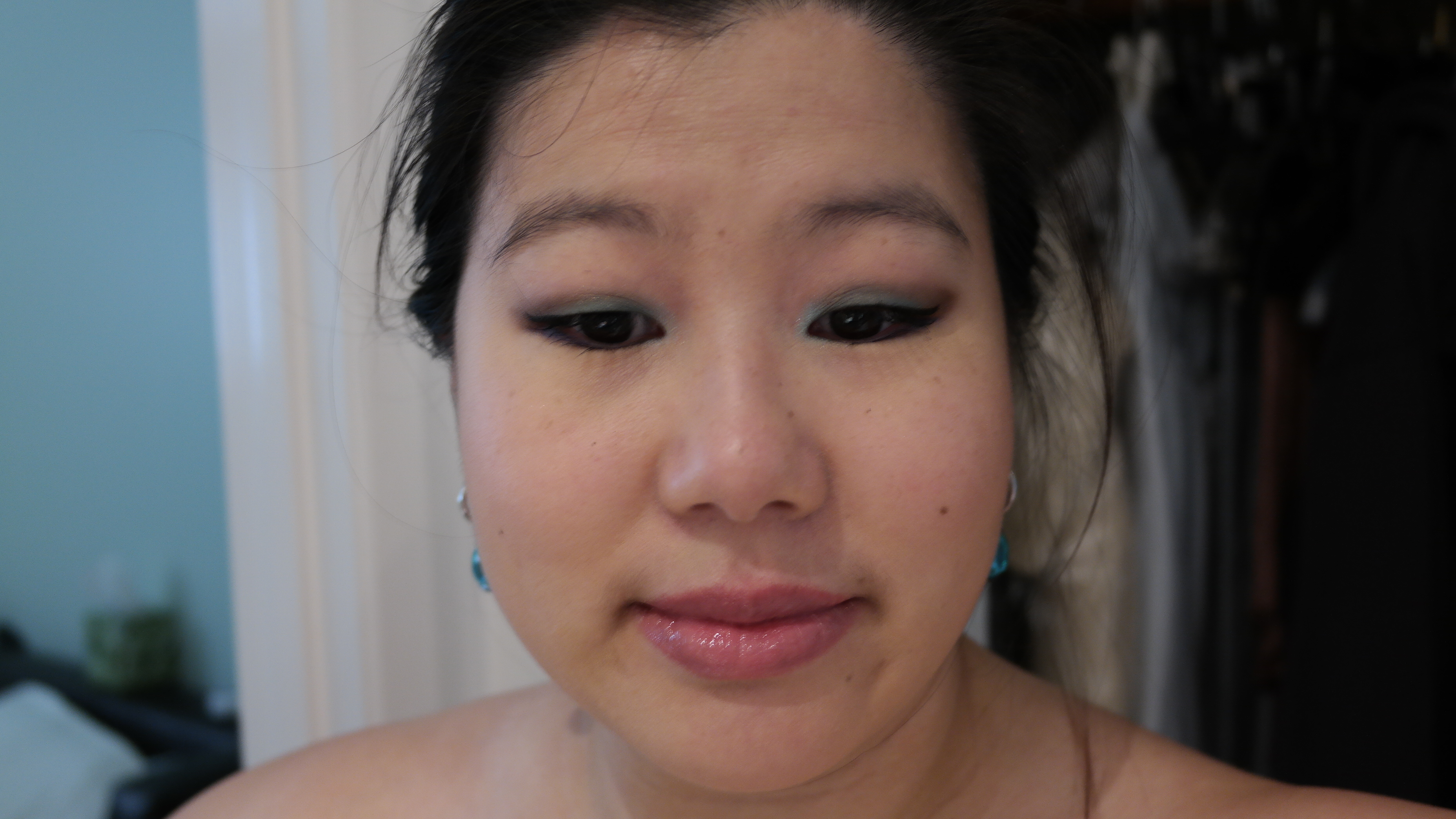
you can see how when used wet, it really makes a difference in the context pictures. the lighter shades brighten the eye more and the darker shades become more pigmented and dramatic.
overall, i’m definitely happy with my purchase. the palette is gorgeous to stare at and pretty on the eyes as well. most of the shadows were pigmented and easy to work with. the ones that gave me the most trouble were Europa and Andromeda, but that’s to be expected since they’re close to my skin tone to begin with. if you like just 3 of the colors, you’ve more than broken even with the singles price. however, if the vibrancy staying true for 7+ hours is important to you, i’m saddened to report these shadows don’t do as well compared to MUFE Artist Shadows, Lorac, or Urban Decay. they do fade a little, and i’m wearing them over Nars’ own primer. i do love how Nars has given us a large range of colors that work well together, and i think the colors themselves are very sophisticated.
if you’re interested in seeing some of these looks under more daylight conditions, please hop over to my instagram. you’ll also be able to see looks that will eventually make their way into future posts!
Readers, yay or nay on using shadows wet? are you still loving the dark jewel tones of winter or are you ready to move into spring pastels?