Laura Mercier’s Limited Edition: Summer In St. Tropez
i have to say i’m very conflicted about this quad. it’s probably one of those items that i know i should return, but i just can’t bear to. look at it! aren’t the colors gorgeous? then you notice it’s half the size of an iPhone 5. the price of this is $44 for .07oz. as a point of comparison, Laura Mercier’s single baked shadows are $24 for .06oz. this means you’re paying almost twice as much for an extra .01oz of shadow and color variation. i don’t know about you, but i’m thinking that makes it pretty poor value. maybe i would have felt slightly better if there weren’t 3 shades of blue in the quad. another color in place of the teal would have given it more versatility. however, all 4 colors are unique in the baked shadows collection.
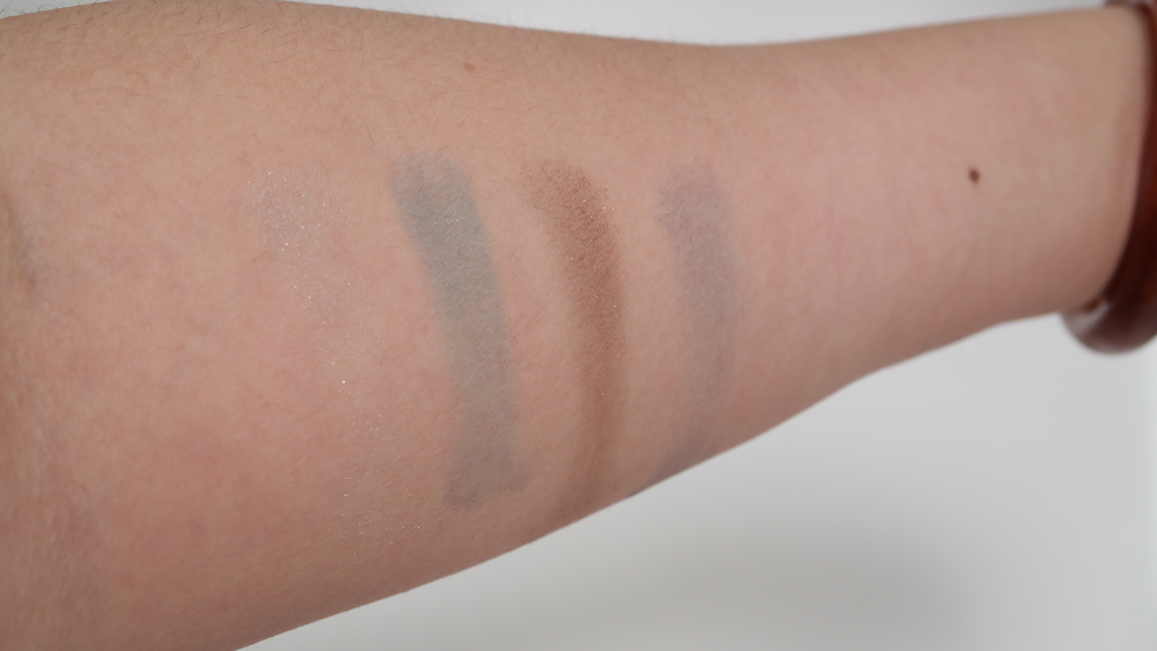
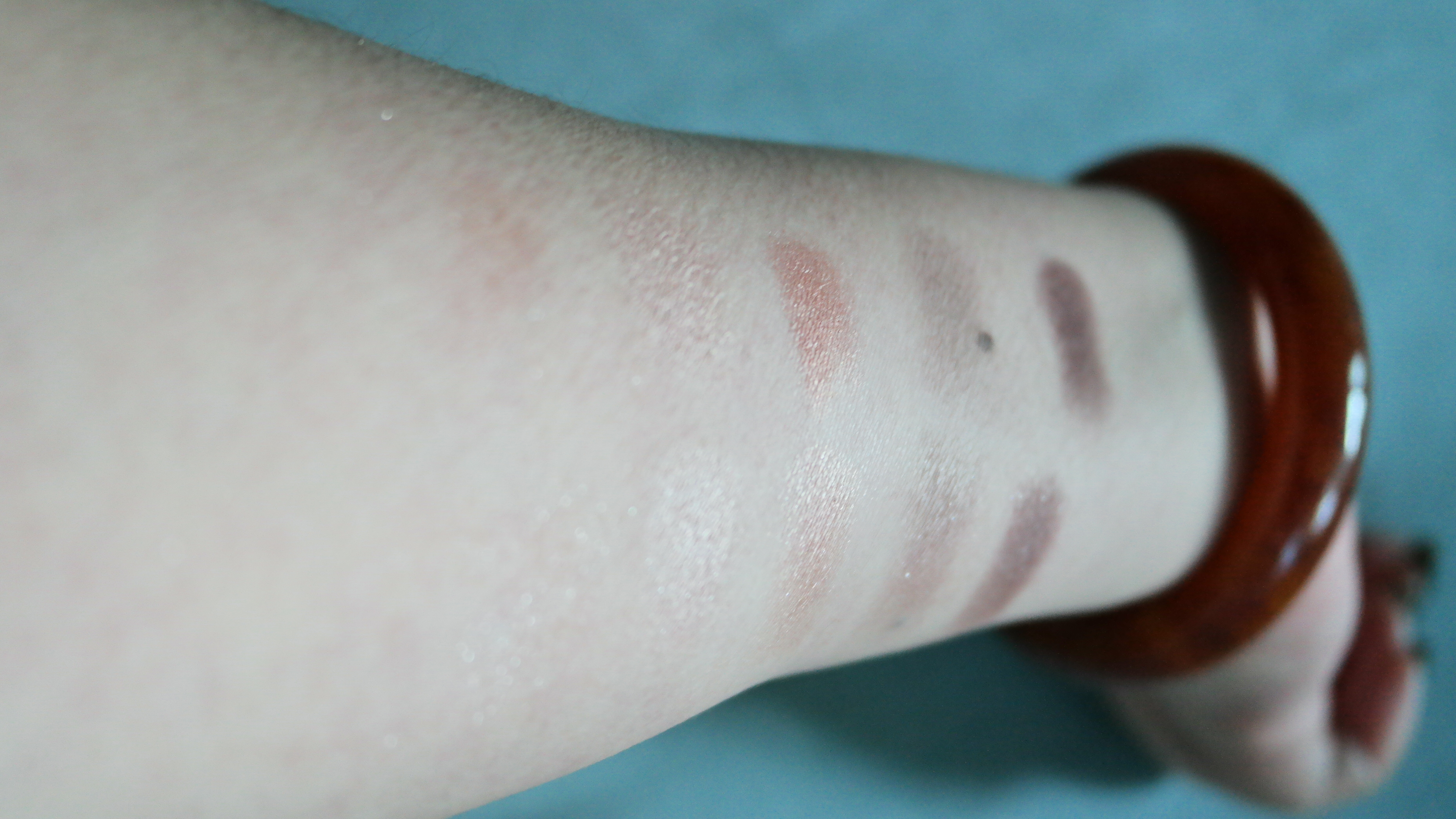
L to R: Pearly Pale blue, Matte Teal Blue, Pearly Dark Bronze, Deep Cobalt Blue
this is what the palette looks like with 3 swipes from my shadow brush, no primer.
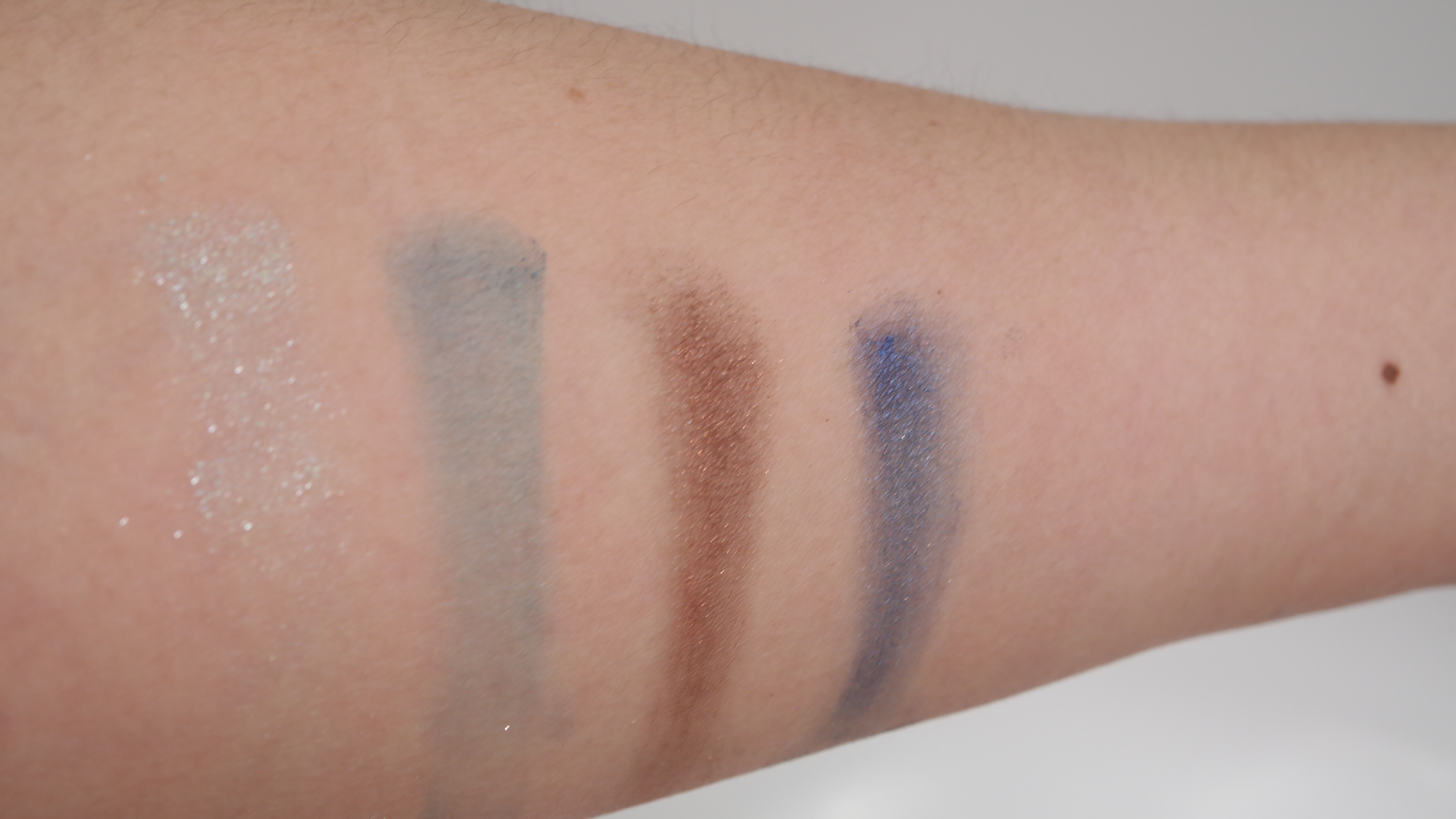
L to R: Pearly Pale blue, Matte Teal Blue, Pearly Dark Bronze, Deep Cobalt Blue
when used wet, the colors become a lot more vibrant and lust worthy.
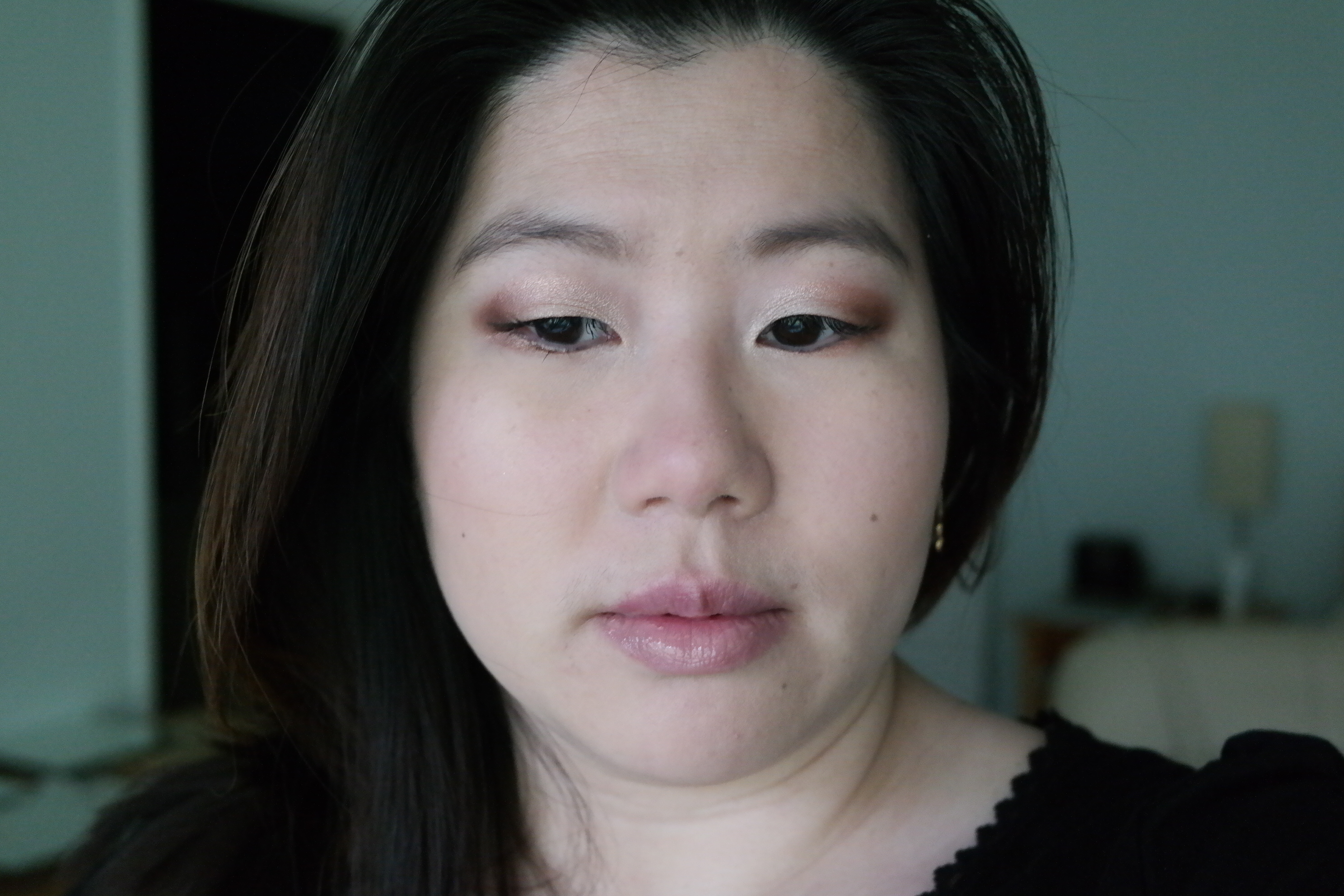
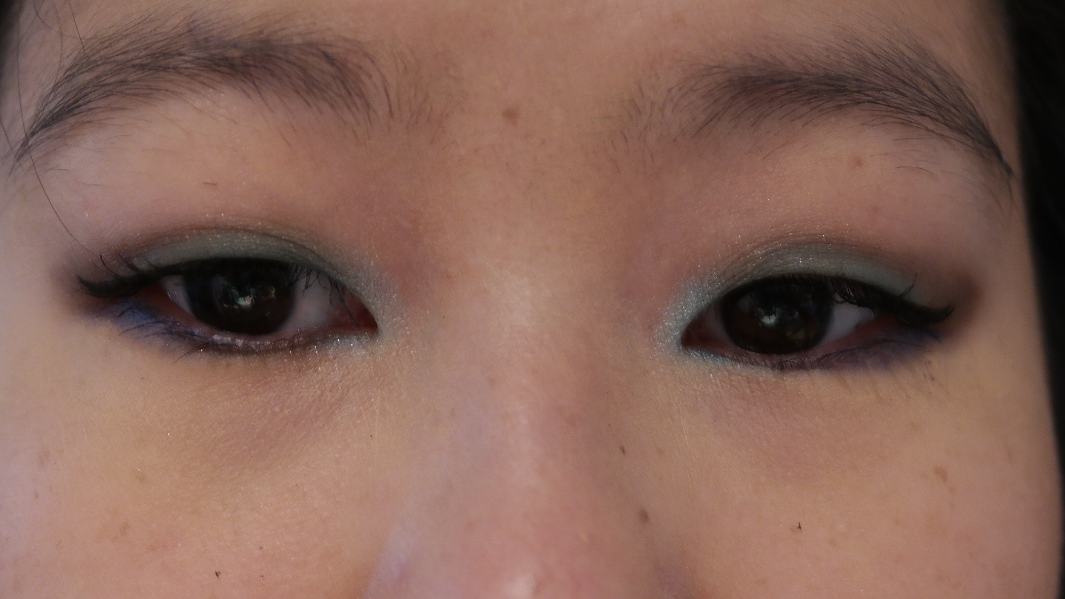
Inner Corner Pearly Pale Blue over Matte Teal Blue, Matte Teal Blue and Pearly Dark Bronze. Wet Cobalt Blue on lower lash line
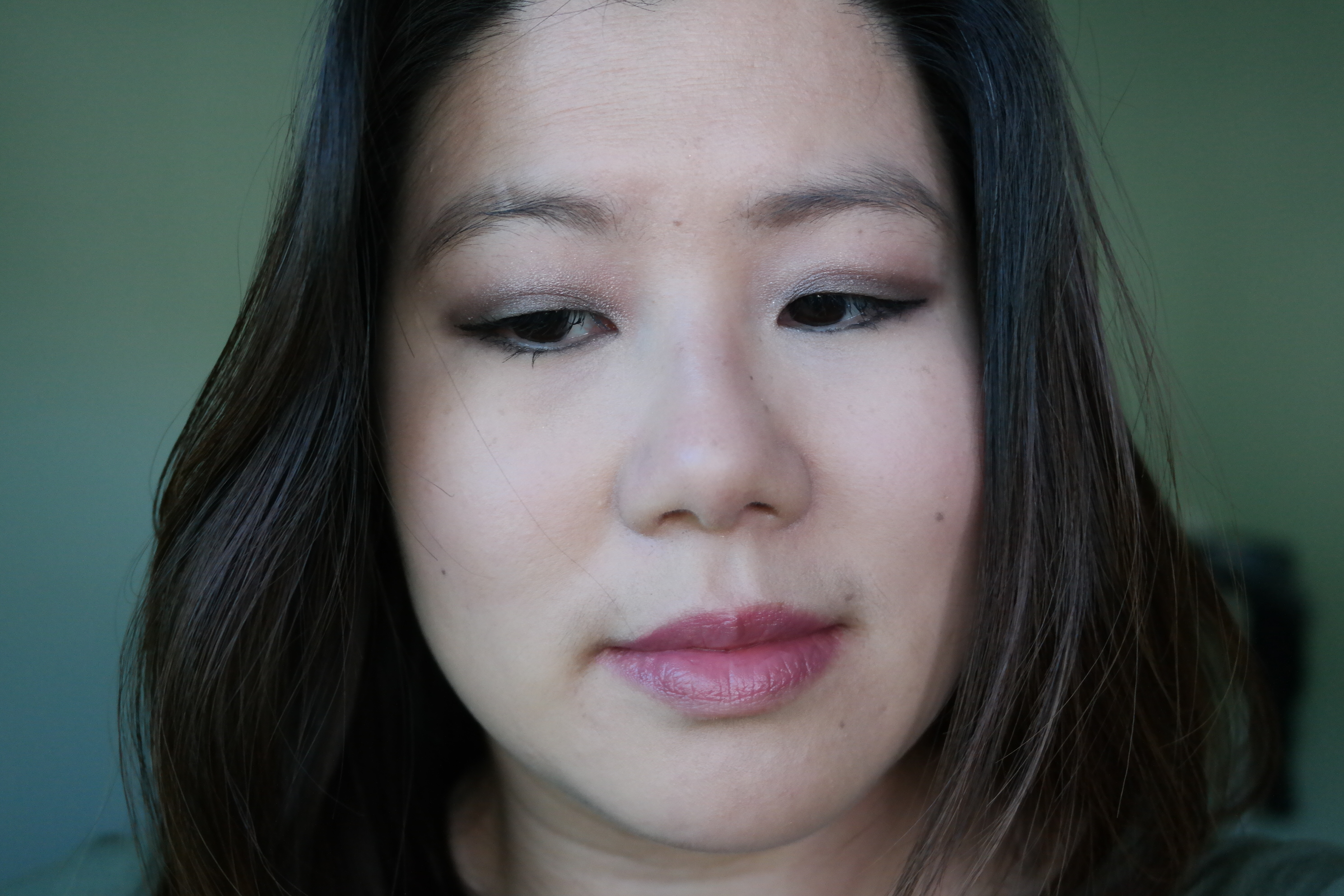
this is how it looks when the colors are applied dry. so far, nothing impressive. in fact, sometimes it applied a little patchy, and i noticed the Matte Teal Blue fading a bit after 5 hours or so. based on this look, i would have sent the palette back pronto!
Inner Corner Pearly Pale Blue over Matte Teal Blue, Matte Teal Blue and Pearly Dark Bronze. Wet Cobalt Blue on lower lash line
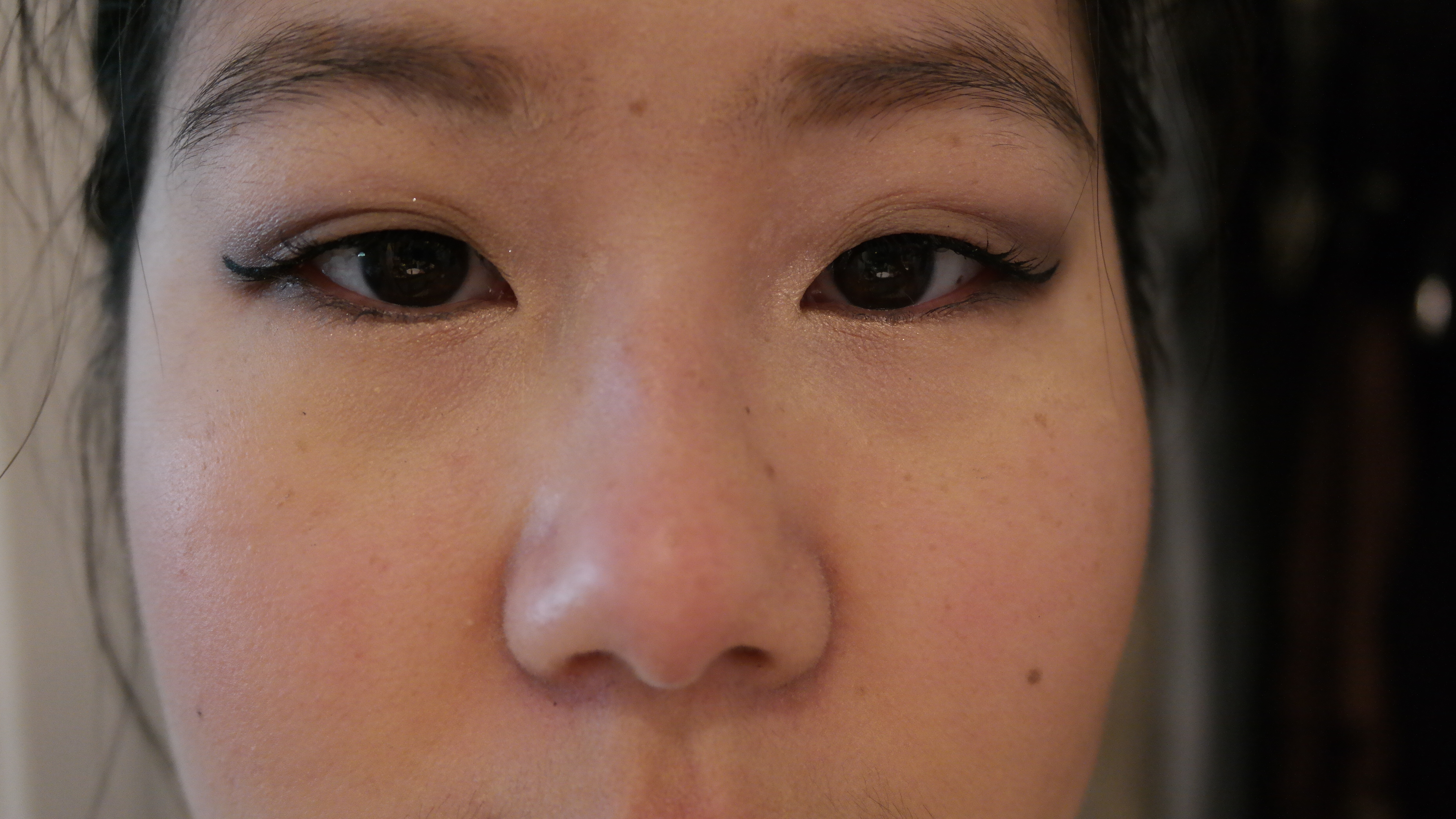
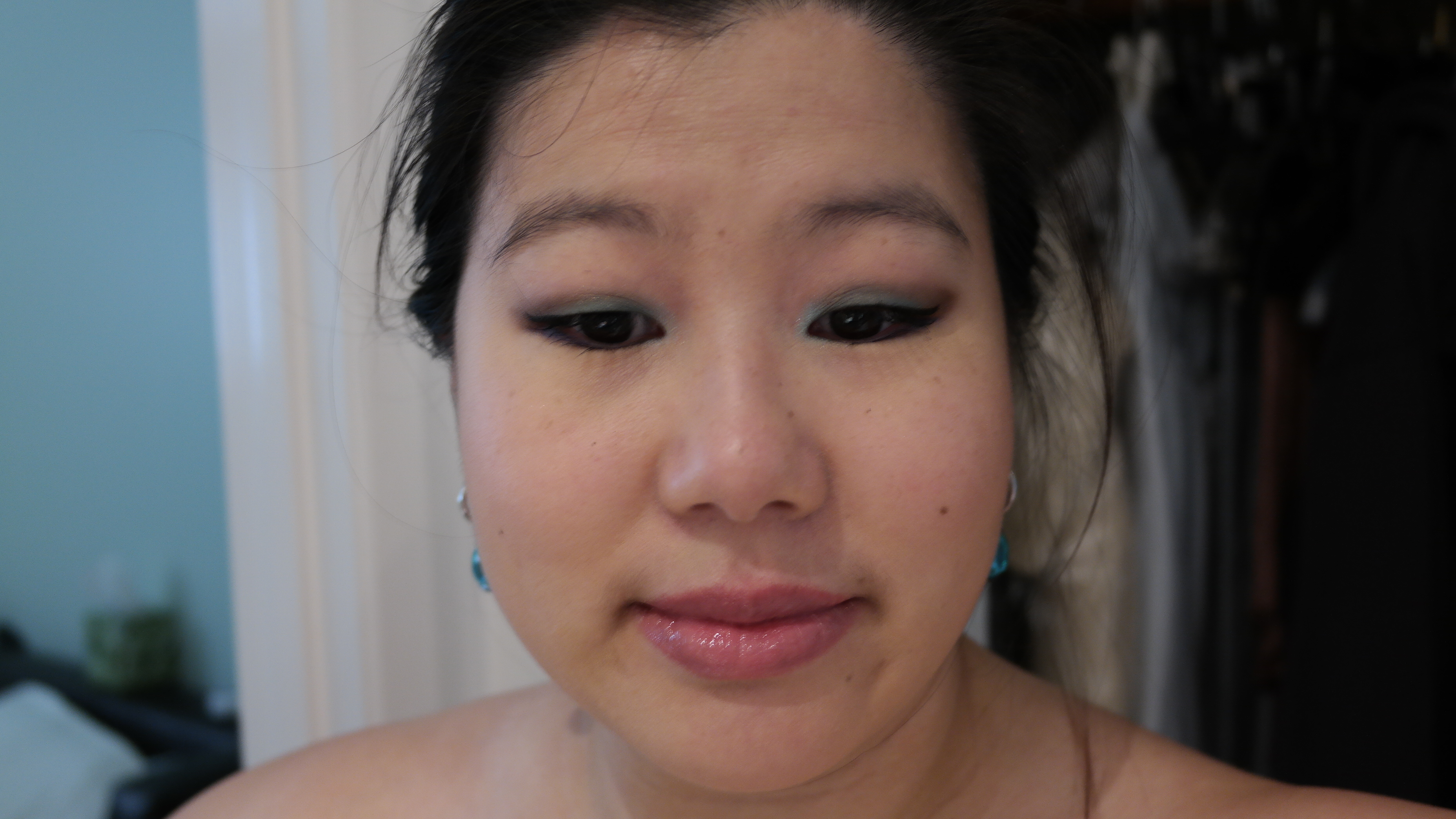
here’s a close up of that look. i lined the lower lash line with the wet version of Cobalt Blue. you can see how it intensifies the color.
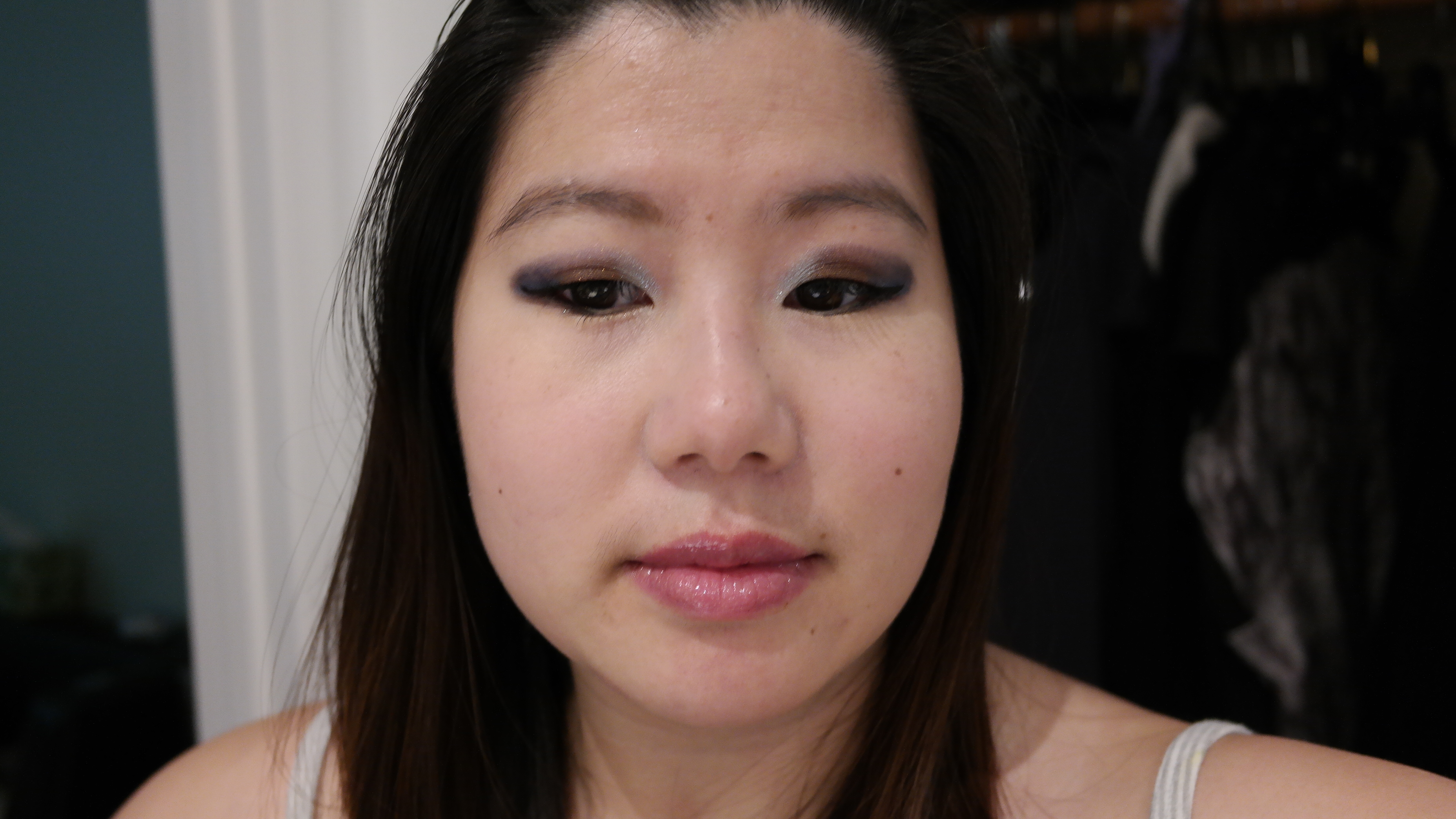
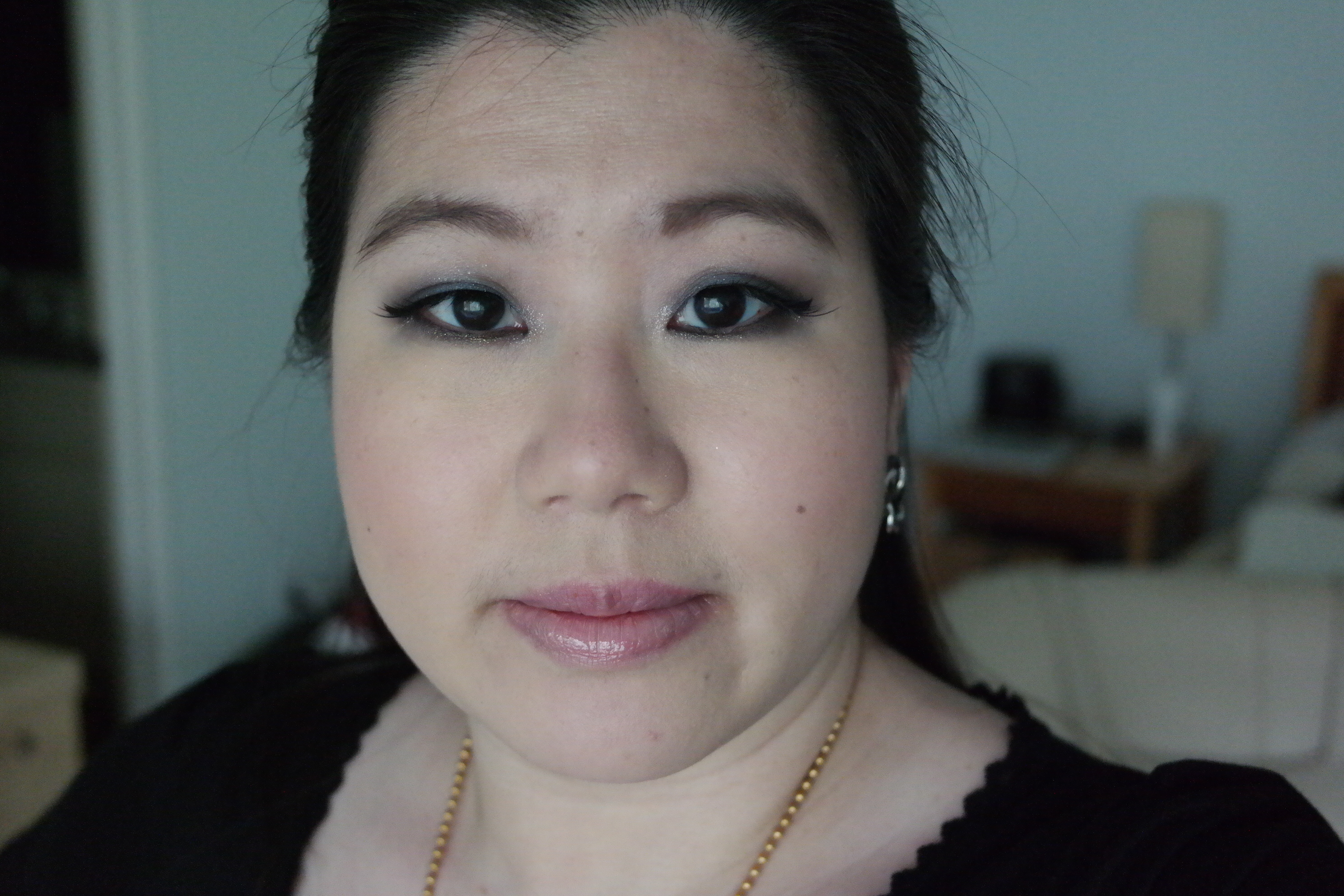
wet versions of Pearly Pale Blue, Pearly Dark Bronze and Deep Cobalt Blue
here’s a look i did when i played with most of the colors wet. isn’t it a dramatic difference? the shimmers show up a lot more, and the colors not only intensify but develop depth and interest. it creates a really high impact look. i’ve been playing with makeup seriously for a year now and asking my boyfriend to grade my looks. this look was the first look that earned a 10. first look in a year guys!!
to create this look, i used my Sigma E57 and E20s. i ran a finger through water and used the water droplets on my finger to damp the brush and patted/swirled the damp brush on the color. don’t make the bristles too wet, otherwise the color will turn into a water color texture that’s a bit too runny to work with easily. it did take a little time to build, but i haven’t had a lot of experience working with foiled eye shadows.
so i bet you’re wondering what’s my conclusion for this palette. for myself, i’m going to keep it. i feel slightly guilty about it, but i’m keeping it for 3 reasons:
1. i’ve been looking for a good cobalt blue, and when wetted, Deep Cobalt Blue fits the bill.
2. look at how satisfying the Pearly Dark Bronze is! the sparkle, dimension, and intensity just can’t be beat.
3. i can’t return the palette that earned my first 10 from my boyfriend. it now has historical and sentimental value!
but what about my recommendation for you? like i mentioned before, it doesn’t have great value, it’s not the easiest to work with and lacks versatility, since it’s mostly blue. i’d say skip it, and save your money for something better unless you fell instantly in love/lust with 2 of the colors, and you really don’t have something similar in your collection. if you sleep on it for a couple nights and you just can’t get it out of your head, then be my guest.
Readers, what do you think? is it worth it? do you have similar colors in your collection? leave me a comment down below!