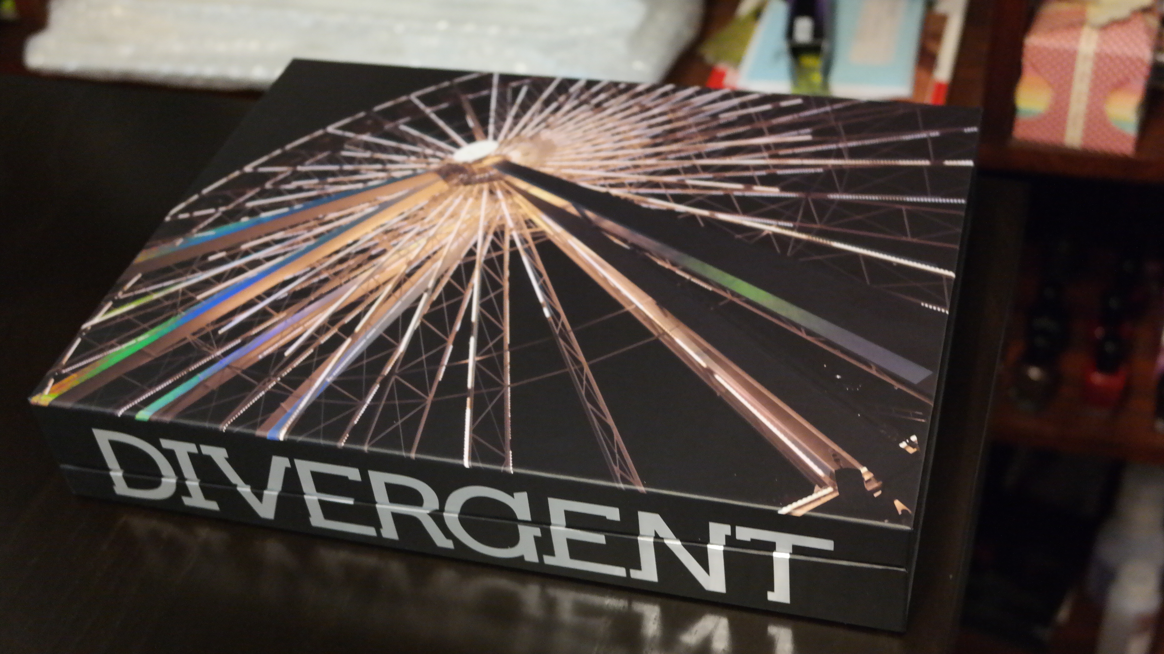
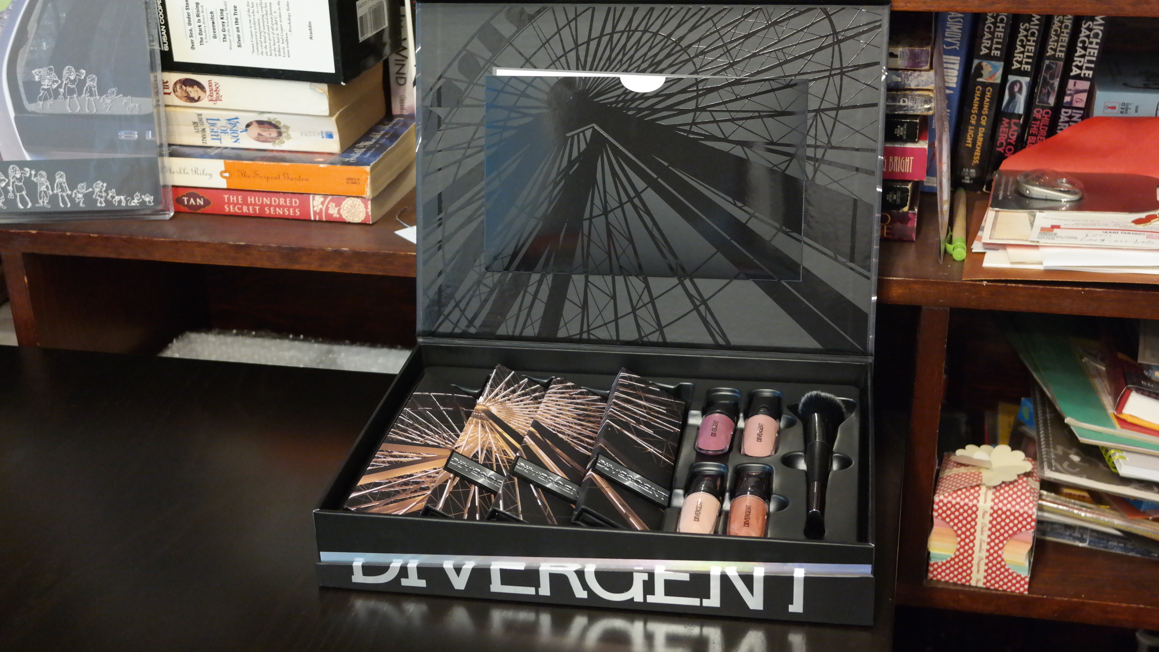
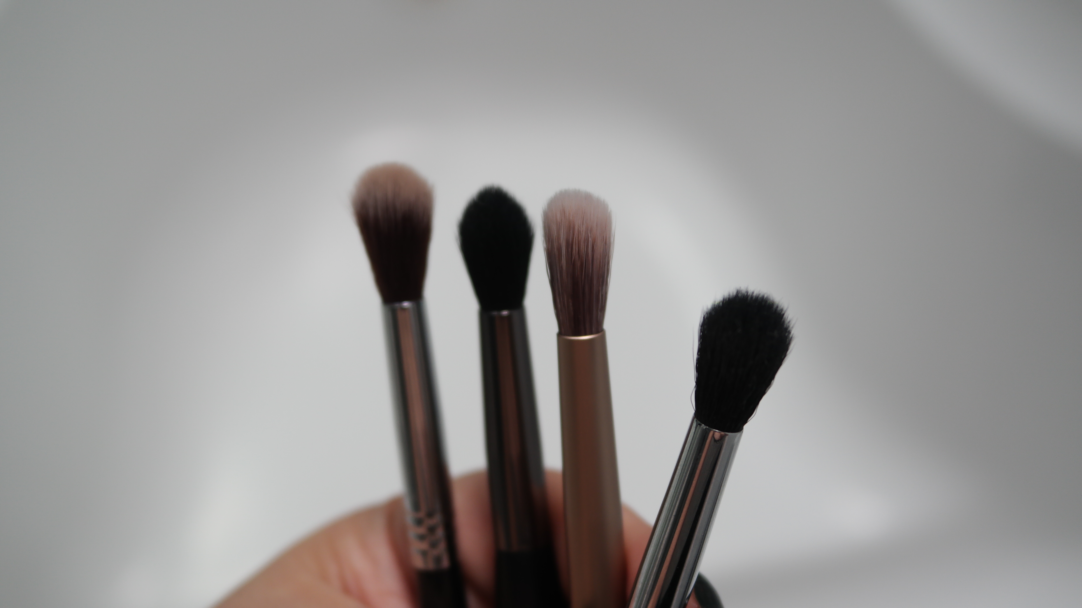
today, i’m going to give an in-depth look at the eye palettes included in the Divergent Multi-Piece Collector’s Kit. there are 3 palettes named after the factions in the books: abnegation, erudite and dauntless. each palette comes with 4 shades and 1 transformer shade. what is a transformer shade you ask? basically a glitter shade for you to mix with the other colors for a different effect. since tris, the heroine, was born into abnegation, let’s start with that.
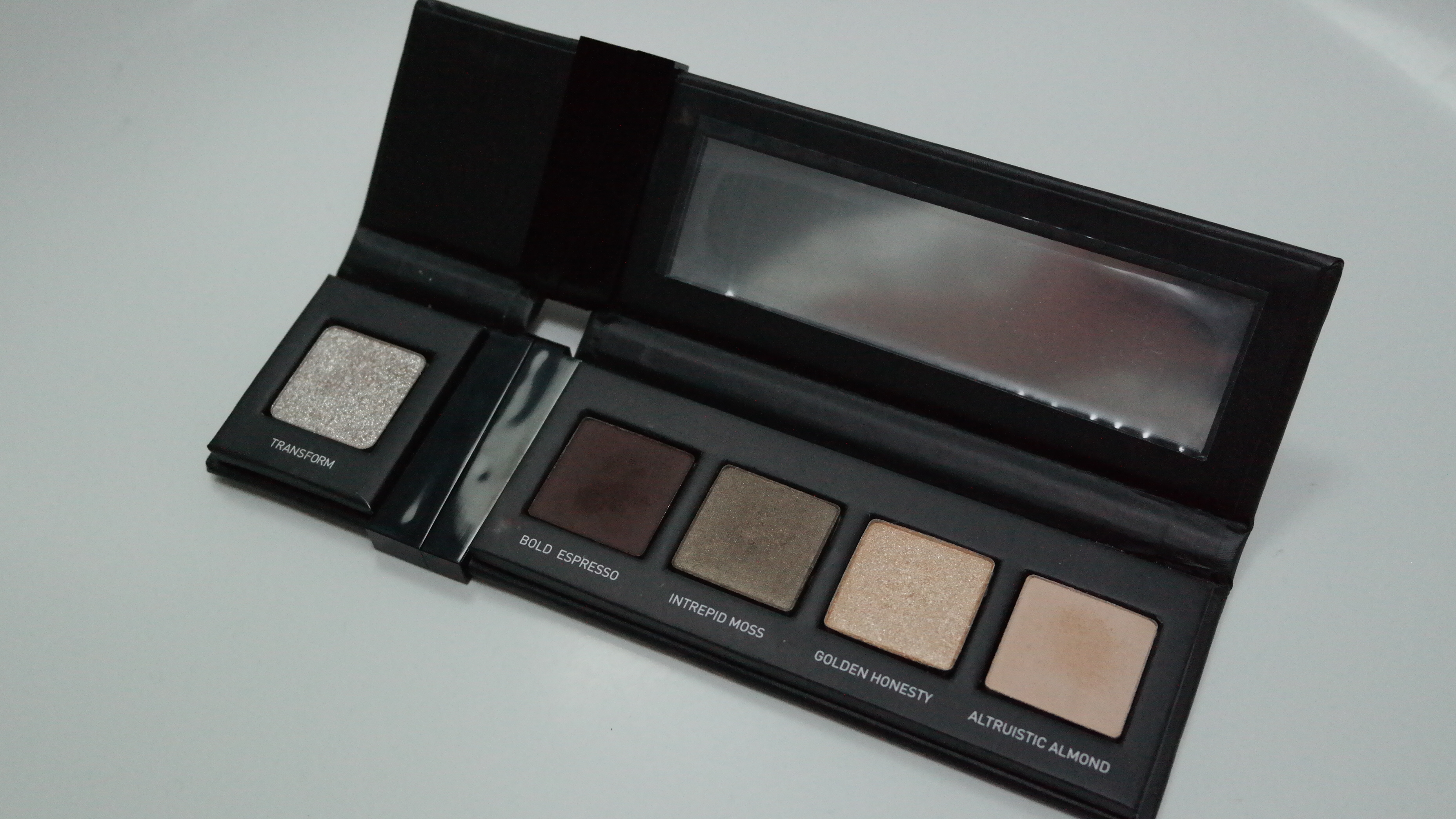
Abnegation Eye Palette
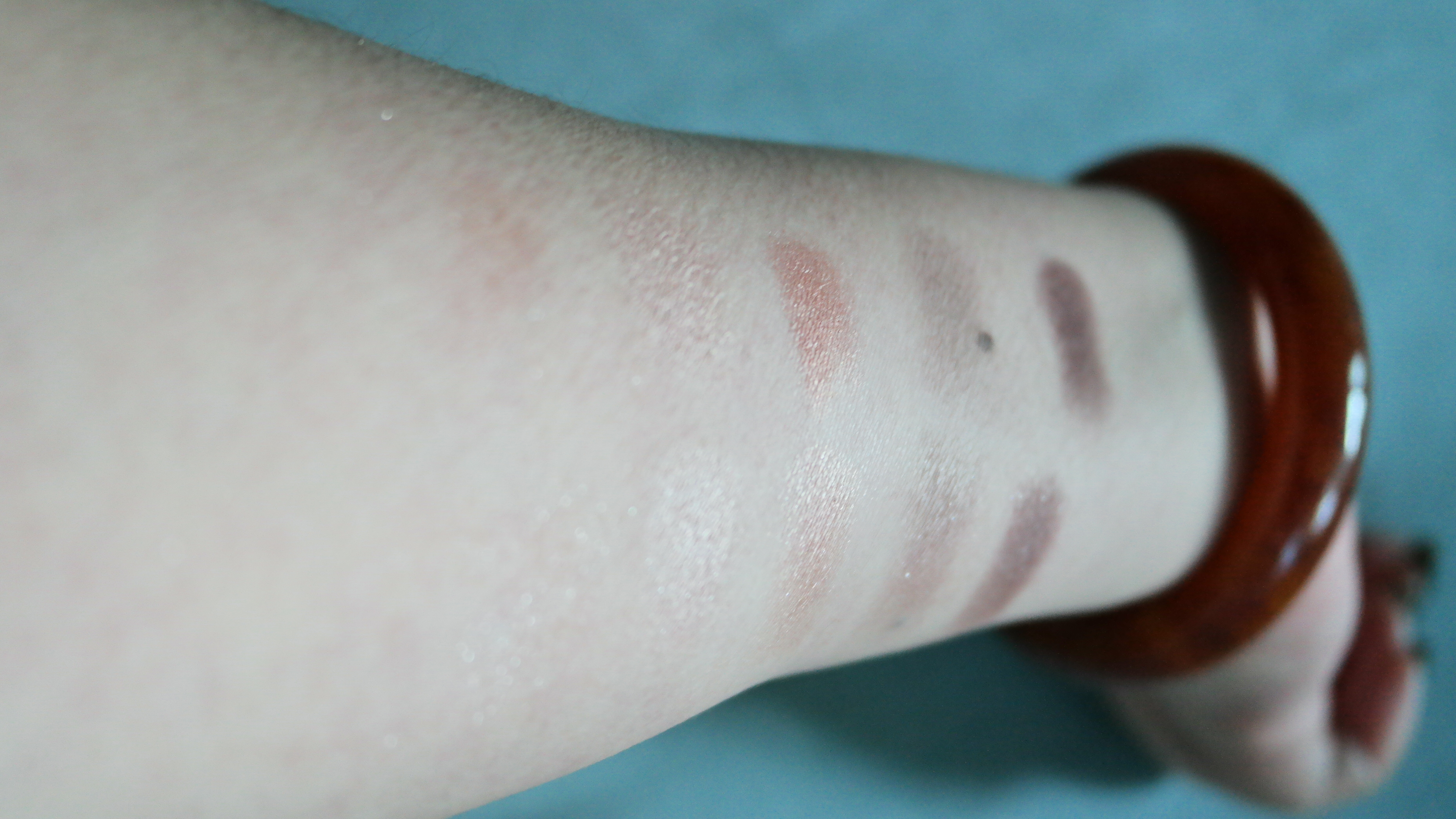
L to R: Altruistic Almond, Golden Honesty, Intrepid Moss, Bold Expresso, Transform
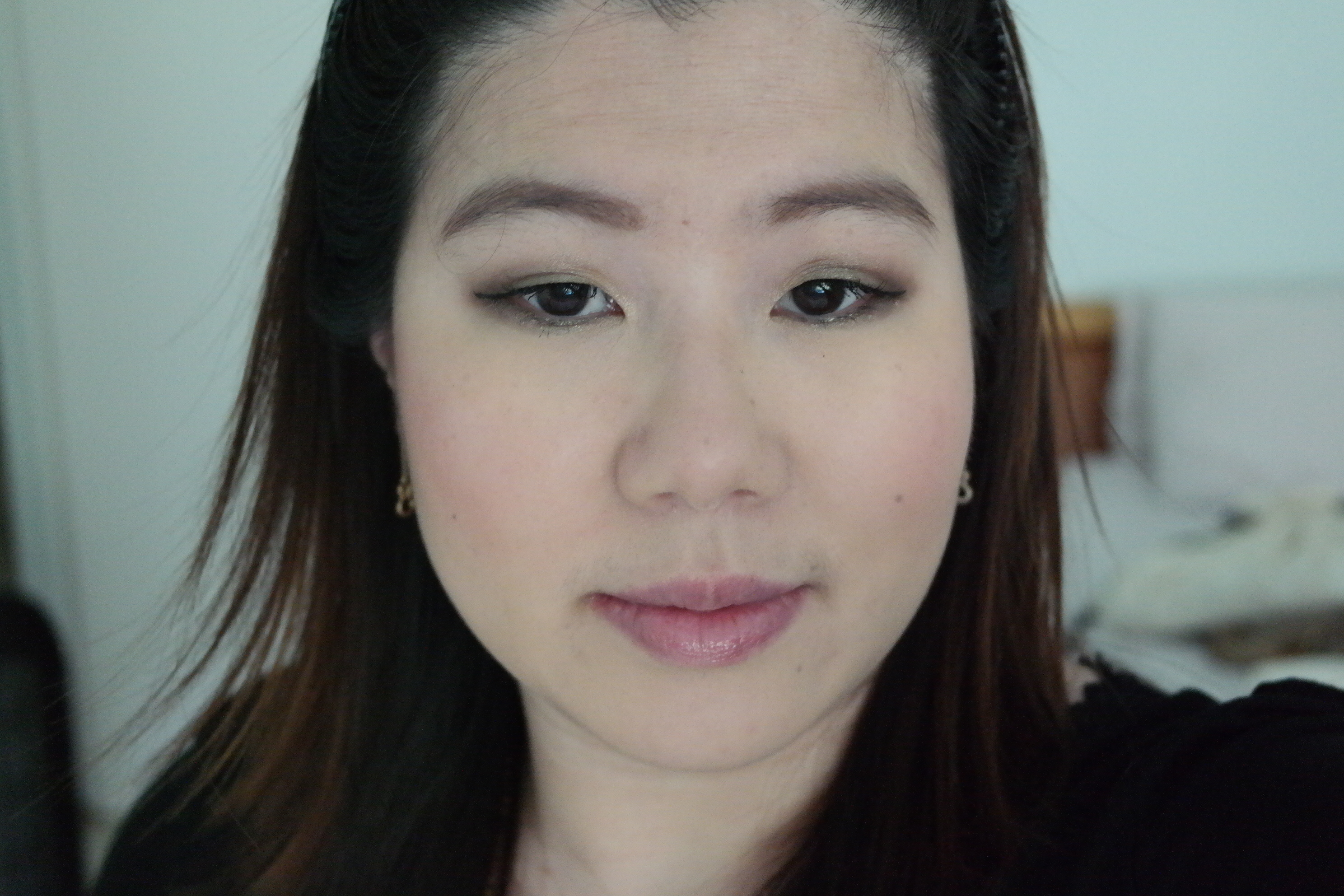
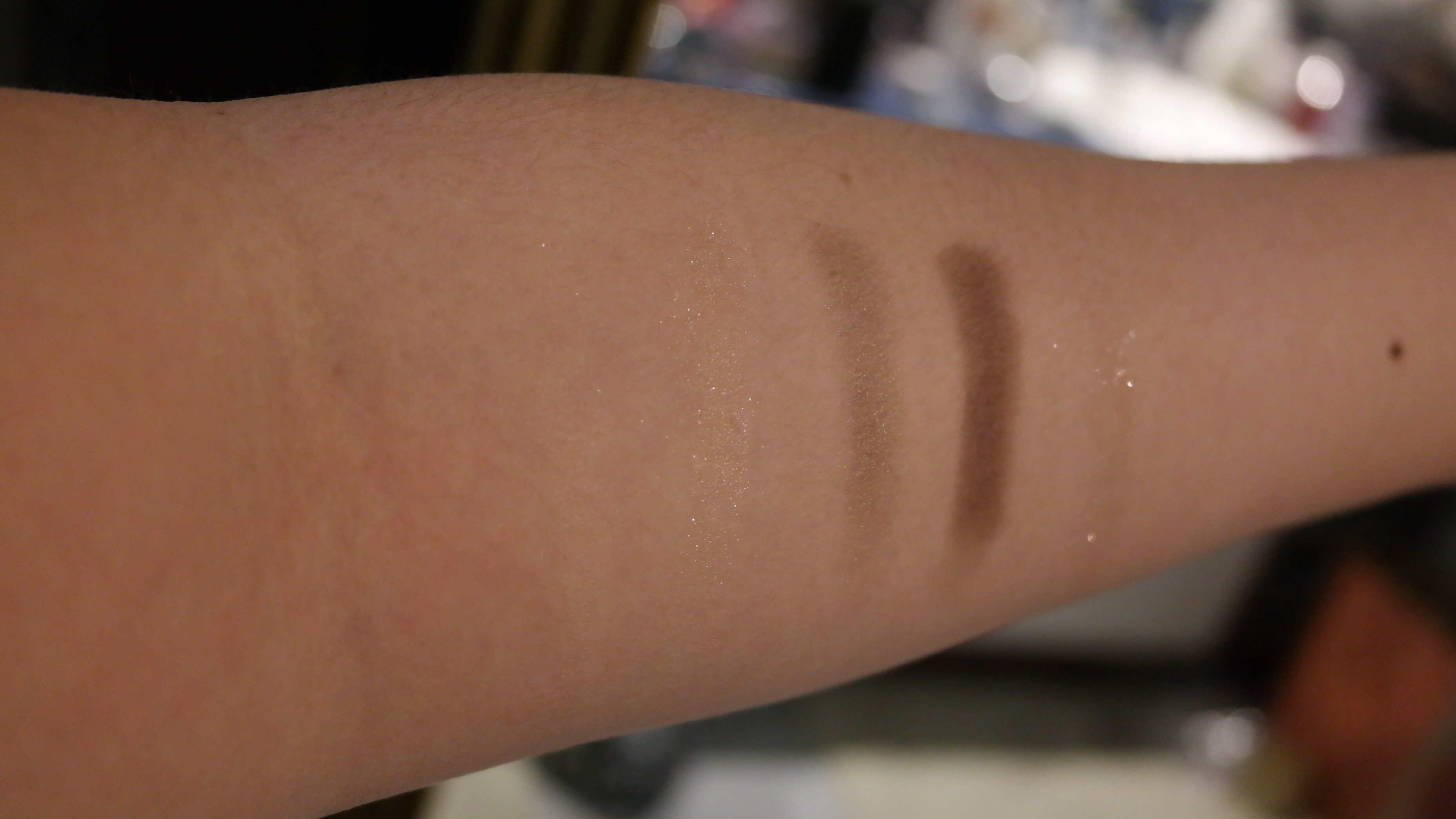
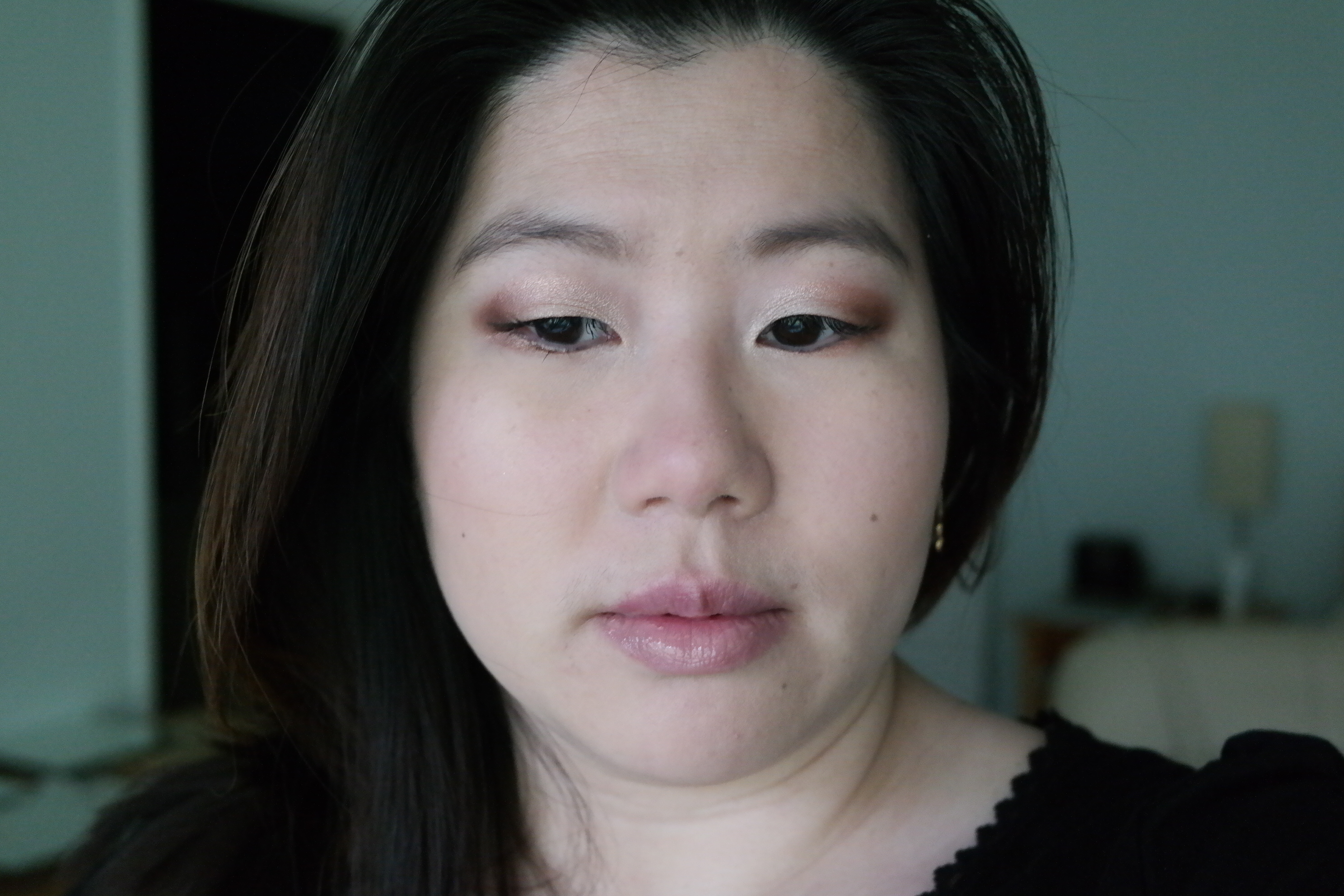
Golden Honesty, Intrepid Moss and Bold Expresso. Intrepid Moss and Transformer on lower lash line
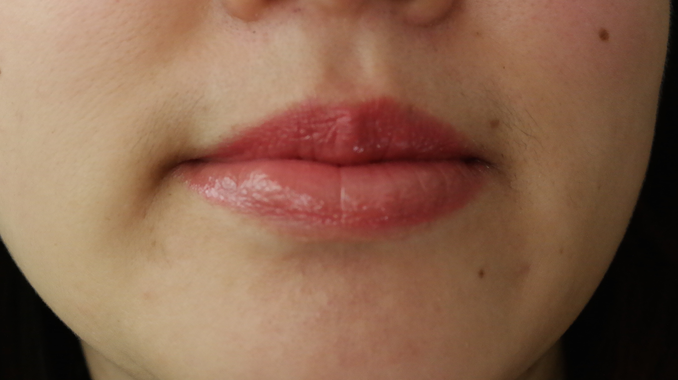
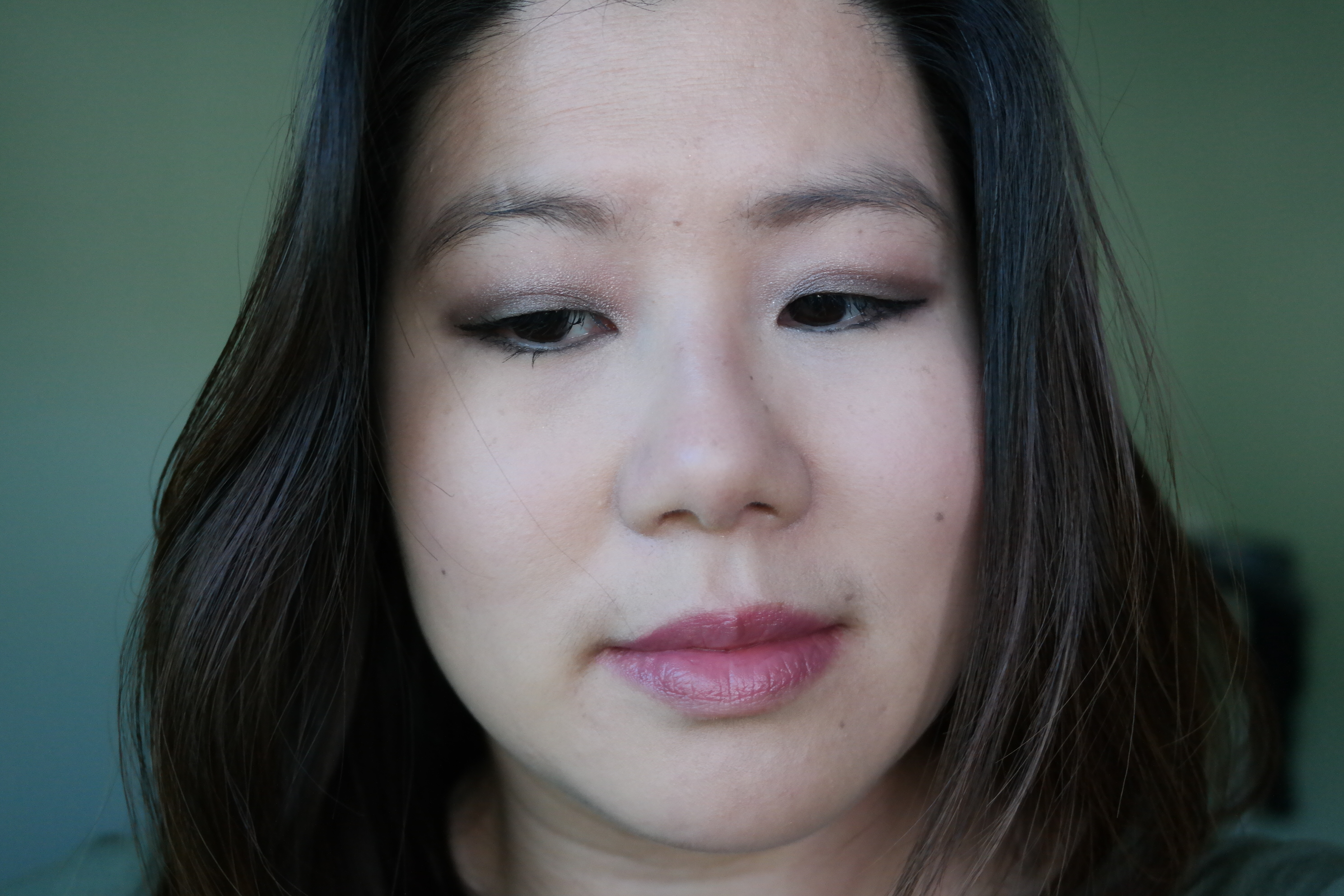
The four regular shades in this palette are all nicely pigmented, goes on smoothly, and blends out well. Altruistic Almond is a matte, skin-toned beige. use this color as a highlight under your brows or over your entire eye to establish an even base for the other colors. it’s slightly darker than Urban Decay’s Foxy. Urban Decay’s Habit is very similar in shade but pinker in tone. Golden Honesty is a very pale yellow gold. i used it as an inner corner highlight in my look, but it’d make for a really good lid color too. i really love how it brightens the eyes. Intrepid Moss is a shimmery, muted olive green. it’s a great medium shade that you can do a lot of different things with. here i’ve used to to transition between Golden Honesty and Bold Expresso. another idea would be to pair it with Dauntless Ink in the Dauntless Eye Palette to create a smokier night look. Bold Expresso is a dark matte brown. this is a nice basic dark color that plays nicely with the Abnegation and Erudite Palettes. blend it out for a day time look, like i’ve done, or build it up to your heart’s content. the glitter shade in this palette is Transform. it’s the worst out of the 3 transformer shades but, by no means, a complete dud. it looks silver in the pan but is really more like a clear coat with silver particles. i used it on top of Intrepid Moss on the lower lash line, and you can see it just adds a little bit more glitter to the look. there wasn’t really much fall-out when used with my Sigma E20S (improved short shader) even when i brushed it on instead of patting it on.
i love the colors of the Erudite Palette, but i have a major gripe with the names. the erudite faction wore blue and valued intelligence and knowledge. they studied, experimented, and engineered. do the colors or names in the palette reflect that? not to me! if i had to choose, i would have named this palette amity.
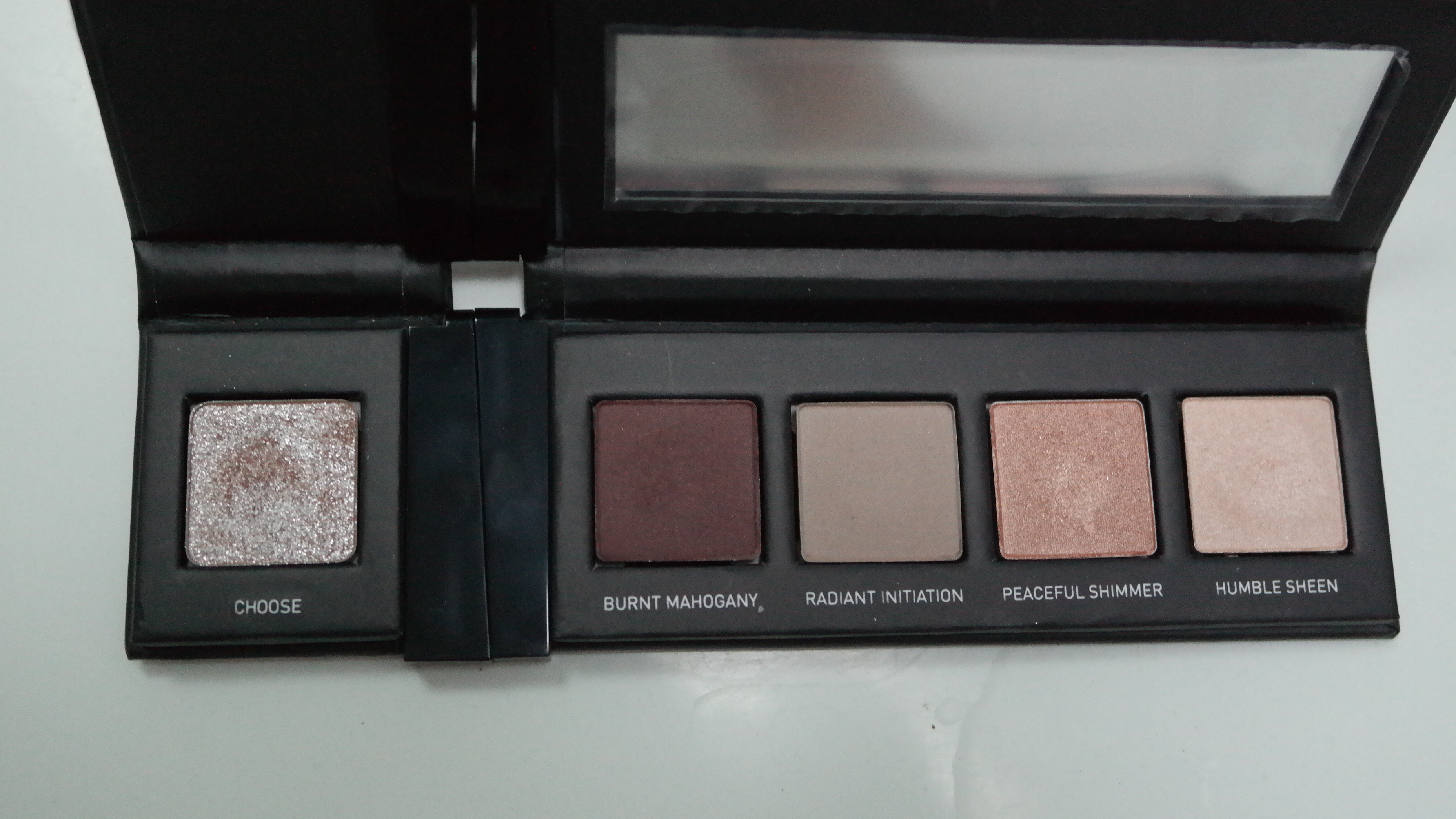
Erudite Eye Palette
L to R: Choose, Humble Sheen, Peaceful Shimmer, Radiant Initation, Burnt Mahogany.
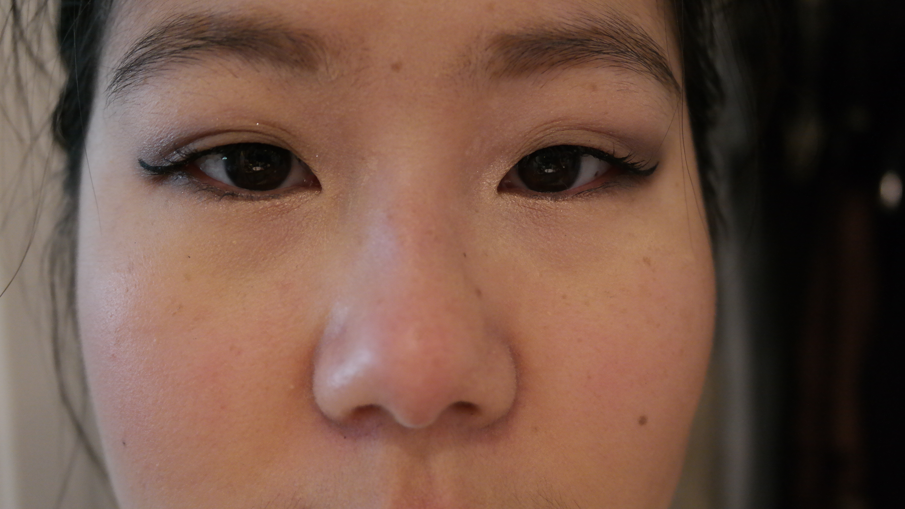
Humble Sheen, Peaceful Shimmer, Burnt Mahogany. Choose on inner corner
Peaceful Shimmer on lower lash line
Choose, the transformer glitter shade for this palette, is a sheer pink glitter. it’s not pigmented on its own but will give a pink tint to what it’s on top of. it’s less patchy than Transform. there’s also no fall-out issue, if you use a light hand, even if you brush instead of press on the glitter. i was pretty impressed by this. Humble Sheen is a shimmery vanilla beige. Peaceful Shimmer, the transition color you see in the middle, is a shimmery peach. Urban Decay Chopper is quite similar but Peaceful Shimmer has a little bit more peach and a tinge of pink to it. it’s a beautiful color that causes me to reach for this palette often. Burnt Mahogany is a rich, red, shimmery brown. it’s very pigmented and easily blended out. it’s a very satisfying color and my second favorite of all the eye colors in this collection. all three of the colors that i mentioned above are buttery in texture, rich in pigment, and easy to work with. in fact, i feel these 3 shades are just a tiny bit better in quality than all the rest of the eye shadows in the collection. Radiant Initiation, however, is slightly less pigmented. it only takes a couple of extra passes though so no huge complaints here. Radiant Initiation is a pale taupe with a light sheen. use it for an every day nude look, or use it to help blend out the dark edges of your smokey looks. i’ve used it for a nude look below.
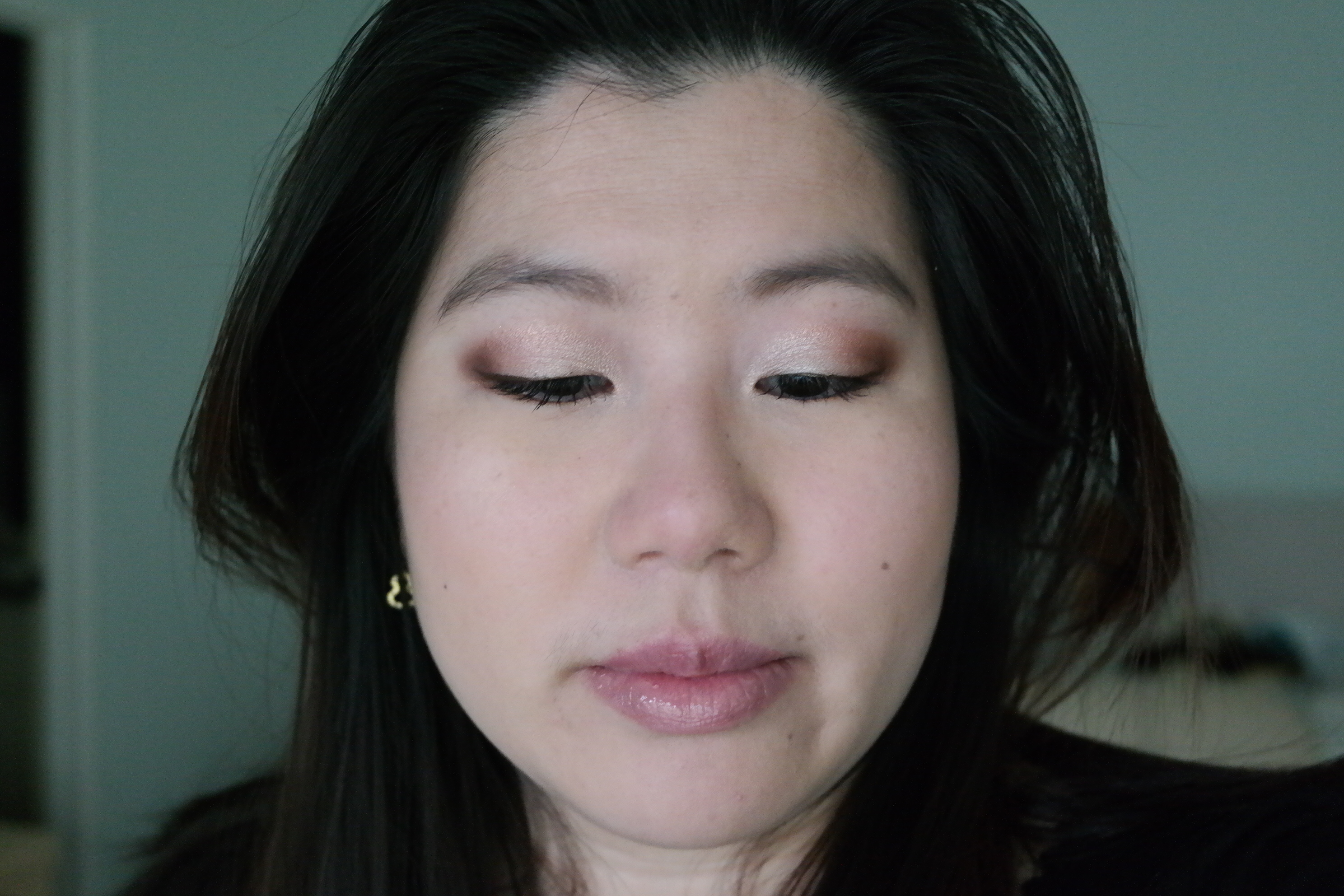
Humble Sheen in inner corner, Radiant Initiation, Abnegation Stone
Dauntless, the faction tris moves to, is the last of the eye palettes. this is a very dark, smokey palette where even the transformer glitter shade is pigmented.

Dauntless Eye Palette
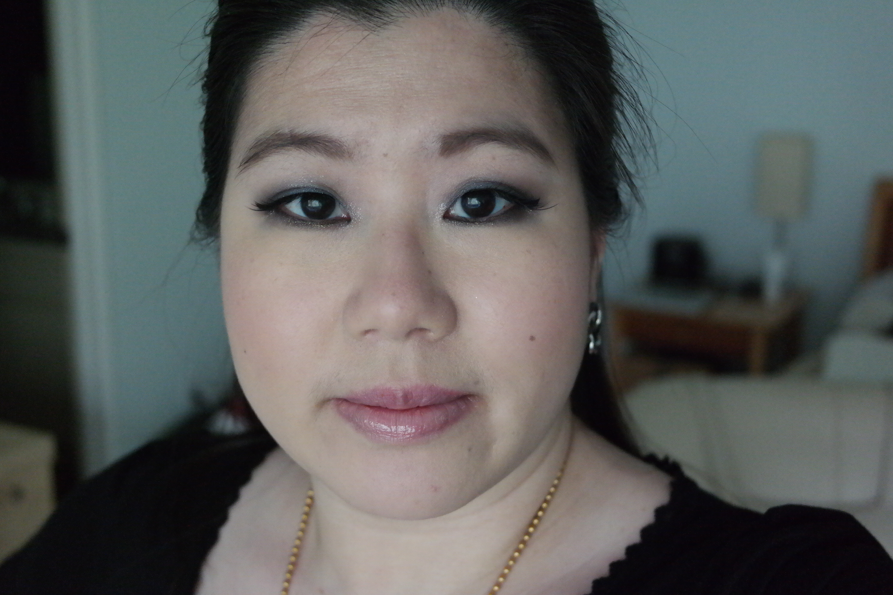
Erudite Sapphire with Dauntless Ink. Serene Vanilla with Transform on top. Transform dabbed in center.
Diverge on lower lash line
i did an arm swatch of this palette too, but all of them came out so inaccurate i decided not to post them. Serene Vanilla is a light creme with slight sheen, i prefer to keep it on the inner corners or on my lid but you can also use it to highlight under your brow. it’s buttery texture makes it easy to apply. Erudite Sapphire is a deep smoky midnight blue with a slight sheen. unless you’re really packing it on or using a base under it, it’s going to look a little darker than it looks in the pan. Dauntless Ink is a matte black. it’s not quite as pigmented as Urban Decay’s Blackout, but it’s still quite pigmented. it’s more pigmented than the black in my Smashbox eye shadow trio in Twilight and my Bobby Brown Day To Night palette in Caviar. Erudite Sapphire and Dauntless Ink are both easy to work with although not as buttery as some of the other eye shadows. Diverge is this palette’s transformer glitter and is a sparkly, smokey olive green. it has some pigment on its own, but i still prefer to layer it on top of another color or else do a couple of extra passes. in the look above, Diverge is on its own in the first third of my lower lashline and on top of Dauntless Ink on the rest. i have a small obsession with green so this is my favorite transformer shade. again, there was minimal fall-out even when brushed on.
Abnegation Stone with Dauntless Ink in outer corner. Humble Sheen on top.
Abnegation Stone is a shimmery medium taupe that’s buildable to dark. it’s more buttery in texture than Erudite Sapphire and Dauntless Ink. the shimmer gives it nice dimension and interest, making it my favorite of this palette.
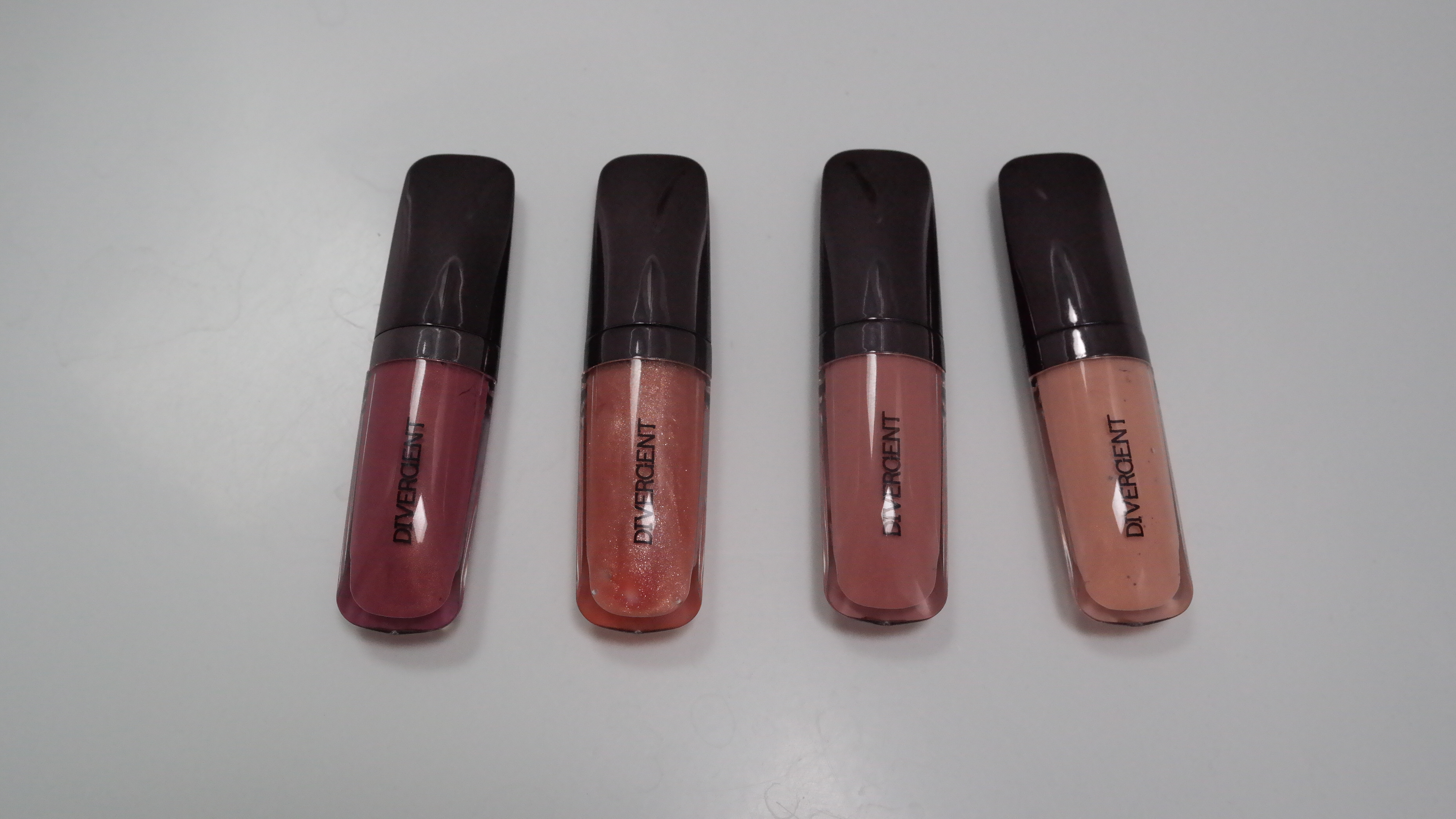
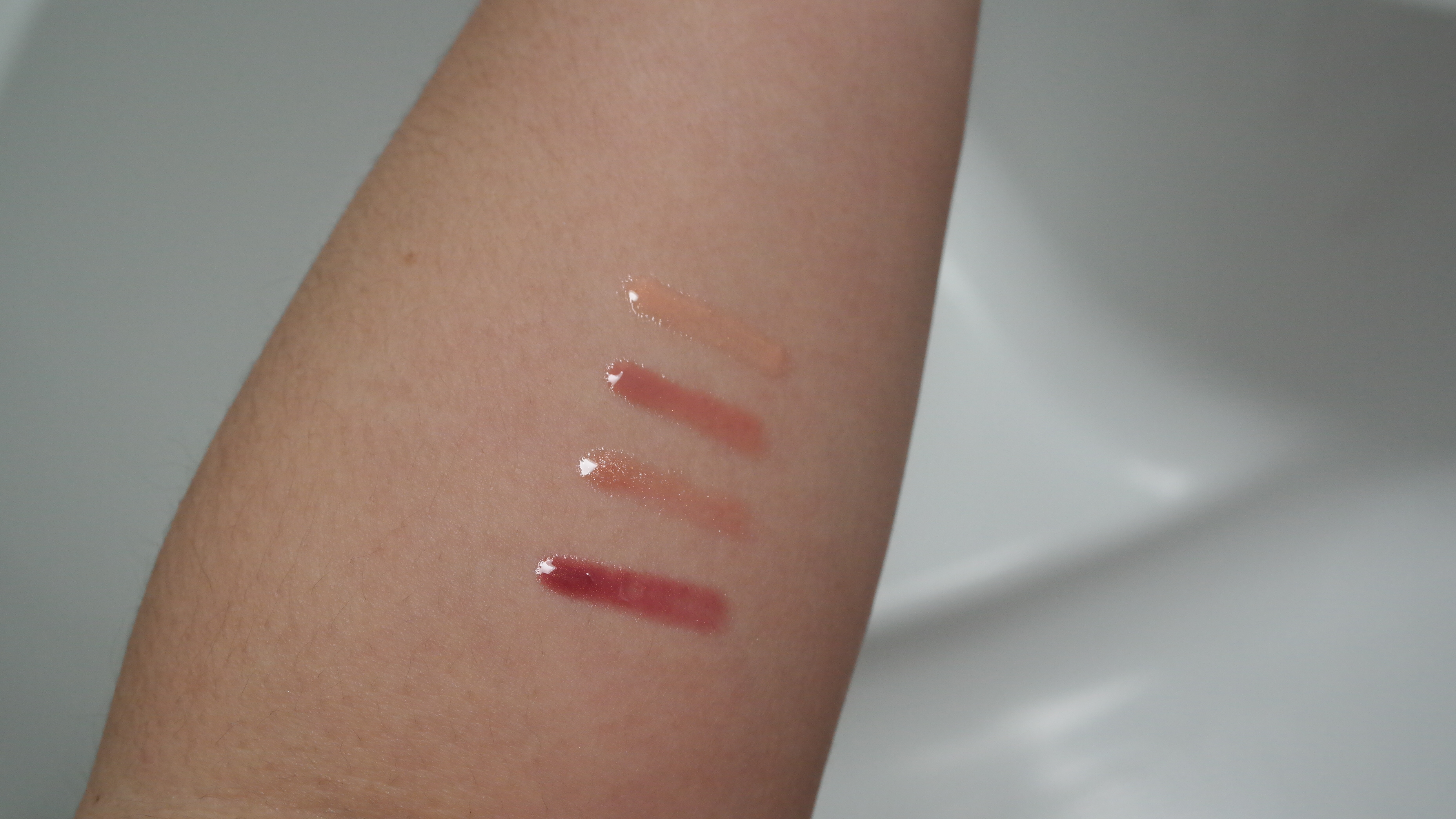
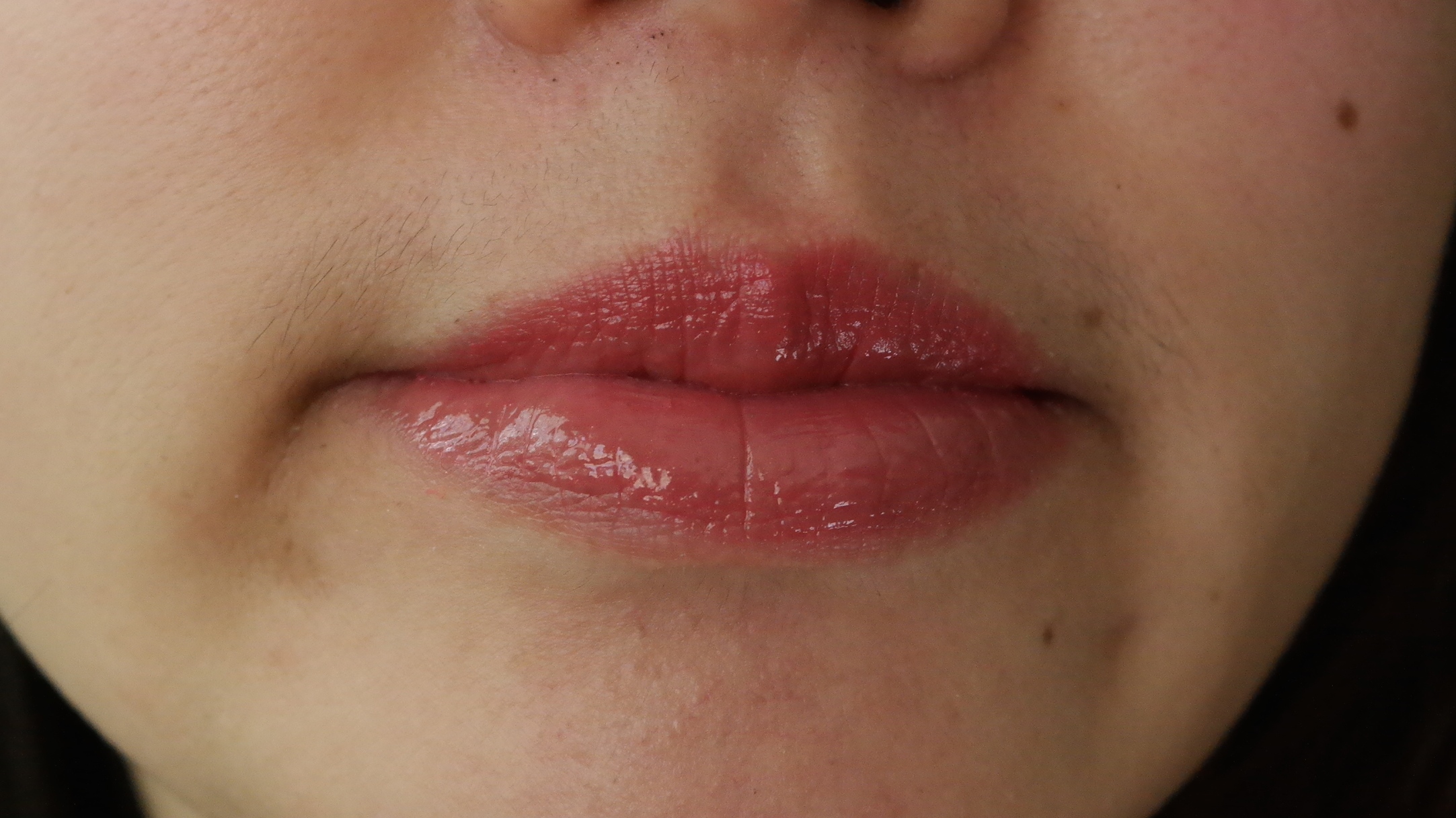
i really enjoyed most of the colors in this collection. though, i wish it had come out during winter season instead of now, when i’m tired of smokey looks and nudes and ready for bright colors. as i’ve said before, i think the collection has great value. there aren’t really any duds that i would avoid. just a couple that take a little extra work. the lip glosses are probably the most disappointing part of the collection. they don’t really do anything besides moisturize my lips; though, they are good at doing that! this collection has really changed my mind about the quality of Sephora’s eyeshadows, and i’d definitely encourage you to pick it up if you like the colors and can find it in stock.
Readers, what do you think of this collection? did you enjoy the looks? leave a comment down below!